WorkSparkify
Rebuilding a field-documentation app from scratch — and the design system behind it
Sparkify is a field-documentation app for electricians — they test and sign off electrical installations, then have to prove it. I joined a product that had grown from a photo tool into a job it was never structured to do, and that averaged only 10–20 documentations a day. As design lead, I rebuilt it end-to-end — the information architecture, the core flows, and the tokenised design system that now carries it across two brands and every surface: iOS, Android and web. What follows is the thinking behind that rebuild — the problems I found, the decisions I made, and what shipped.
600
Documentations created a day
30–60× the old app’s average of 10–20 a day
~7 min
From measurement to signed report
Tested by electricians on a full report — the old way ran across days
27
Languages shipped
One task-first structure, localised across the EU
Real product analytics and field tests with electricians — see the full outcome.
My role
- Product design, end-to-end
- UX research & user flows
- Wireframes → clickable prototypes (low → high fidelity)
- Design-system architecture (tokens & components)
- Design language & multi-brand theming
- Web client — desktop surface
- Marketing site — sparkify.cloud
- Developer handoff — iOS & Android
The team
- CEO, CFO, CTO & CCO
- Co-founder & designer; designers from Wiha
- iOS & Android engineering leads
- ML / image-recognition & QA
- Master electricians — field testing
- Investors & academic advisors
Deliverables
- Rebuilt information architecture & user flows
- Wireframes & high-fidelity clickable prototypes
- Tokenised design system (published library)
- Two brands from one system (Onstruc + Sparkify)
- Component library for iOS & Android
01
The starting point
An app that had grown into a job it was never structured to do — and that few had adopted.
It had started life as a photo tool — take pictures on site, attach them to a job — and as the ambition grew to real documentation, flow after flow got bolted onto it. The problem was structural, not cosmetic; no restyling would fix it. So the call, agreed with the team, was to rebuild from the ground up rather than patch.
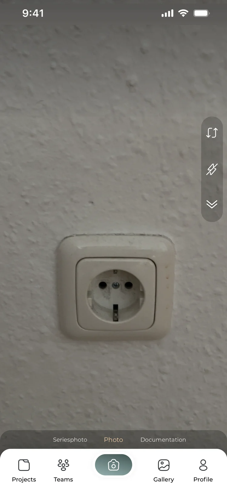
The camera was the app The main verb was take a photo — not document a job.
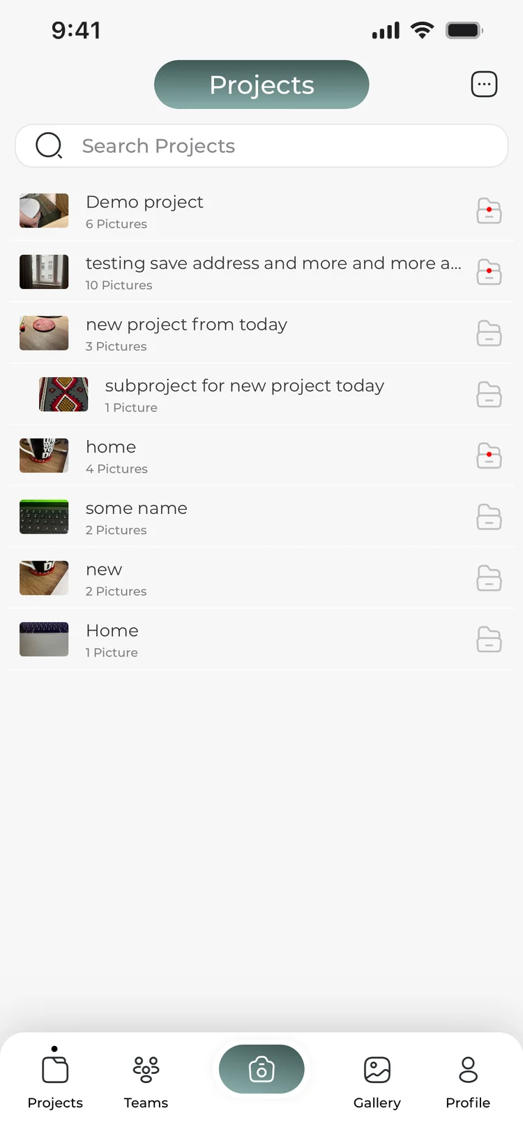
Projects were counted in pictures The unit of work was the image, so nothing in the model knew what a finished report was.
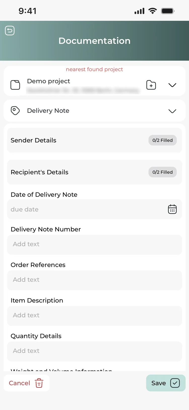
Documentation arrived bolted on A long flat list of fields, unrelated to the standard the report had to satisfy.
The work finishes on site, but the paperwork follows them home.
Documentation is the part of the job electricians like least — done on a ladder, in a basement, one-handed. A tool that demands concentration won't get used. So one measure governed the rebuild: speed. Make documenting faster than paper, and the tool becomes the obvious choice.
The classic way
Measure. Note it down. Transfer it later. Fix the mistakes. Compose the report.
The customer gets a Word or Excel file with a printed signature — days later.
The goal I designed toward
Pull the readings, sign on site, produce the finished report on the spot.
The customer gets a signed VDE PDF with the electrician's logo — before they walk out.
02
The insight that unlocked it
The structure users needed already existed in their trade, not in the software.
This came from research, not a hunch — interviews and journey mapping around the whole job, from arriving on site to handing over a signed report. One pattern ran through all of it: German electrical work is already standardised. A job is named after the standard it follows — device testing under VDE 0701/0702, installation tests under VDE 0100-600 — and that standard already prescribes what has to be measured and recorded. Electricians don't think “I'll create a custom document”; they think “I'm doing a 0100-600 today.”
So the app was flipped around that. Instead of a blank canvas, it asks one question:
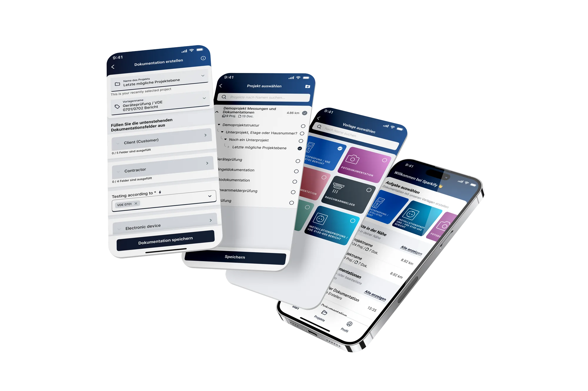
What task are you doing today?
Every answer is a ready-made template shaped like the real job. The concept was proven in low-fidelity wireframes with electricians before a single high-fidelity screen was drawn — and it became the test every later decision had to pass: does this mirror how the work already happens, and does it make it faster?
Then we tested the rebuilt app in moderated sessions with users. One session, mapped stage by stage, and what six of them had in common:
Creating a photo documentation and updating it
“How to close the keyboard?”
“I want to add more images”
- Scrolling horizontally through the Field-sets
- Reviewing the Home-screen generally
- Tapping the Photo documentation template
- Triggered the camera permission and granted it
- Took the photo
- Wanted to add another photo
- Tapped the comment field and added a comment
- Could not leave keyboard mode after adding the comment
- A colleague helped at the end
- Browsing all documentations
- Opening the last one created
- Updating it with a new photo
- Trying to work out what is on the screen
- Finds the Field-sets prominent (positive comment)
- How to add another photo
- Writing a random note
- How to get out of the keyboard?
- Unsure about the retake button on the camera screen
- Replacing the photo
- Comfortable in browsing
- No frustrations
- Only obstacle: unsure he was making the right choice
- Why can he not add another photo?
- No functionality for that
- No frustrations
- No obstacle
- Could not leave keyboard mode
- No obvious way out
- Hard to accept that he cannot add more photos
- No opportunities noted
- Allow adding more photos
- No opportunities noted
- Help users get out of keyboard mode
- Add a “Done” button above the keyboard
- Allow adding more photos
- Make clear the Photo field is editable
| Finding | P1 | P2 | P3 | P4 | P5 | P6 | Sessions |
|---|---|---|---|---|---|---|---|
| Single-choice field problems (manufacturer: multi-select pattern, odd scrolling) | noted | noted | noted | noted | noted | 5/6 | |
| Keyboard won't close, or hides the Save button | noted | noted | noted | 3/6 | |||
| Project and documentation not told apart | noted | noted | noted | 3/6 | |||
| Permission prompts unclear (“Remind me later”, “Ask me”) | noted | noted | noted | 3/6 | |||
| Photo editing hard to discover | noted | noted | 2/6 | ||||
| Workspace not explained | noted | noted | 2/6 | ||||
| Typo in the GDPR onboarding title | noted | noted | 2/6 | ||||
| Demo project with sub-projects suggested | noted | noted | 2/6 |
Every round of testing went back into the design, and we kept iterating the app until it met the goal: documenting faster than on paper.
03
The decision before any screen
One nested hierarchy, settled first, because it's the one thing every screen inherits.
Get it wrong and every screen spends its life fighting it. Each scope shows only what belongs to it, so users are never lost, and settings made high up cascade down automatically — fewer things to enter, less to get wrong.
Values cascade. A prefilled value set at the workspace level flows into every project and document beneath — inherited fields appear pre-populated and marked, so the electrician confirms rather than retypes.
04
The flows that earn their keep
With speed as the measure, every feature exists to take a step away from the person on site.
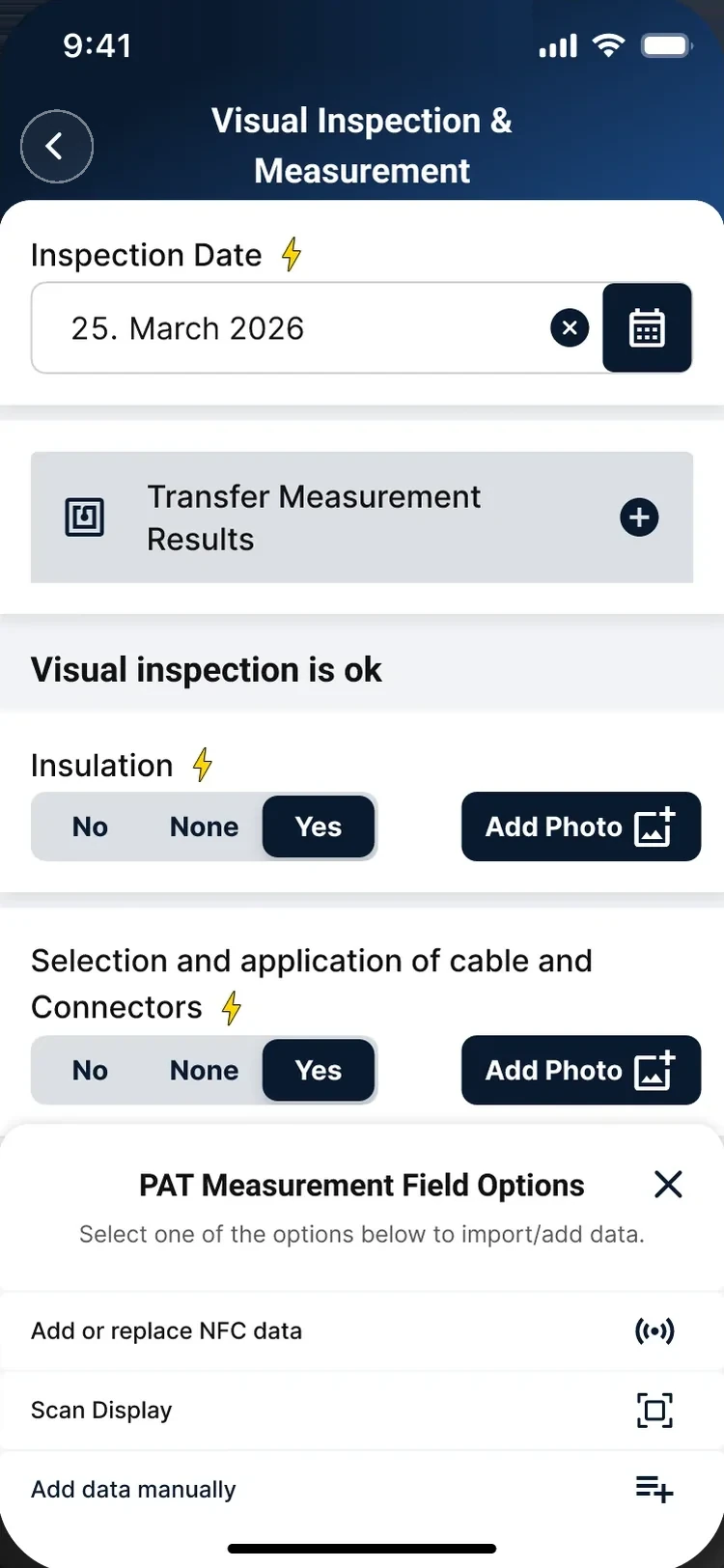
NFC · Measurement import
The fast path, made optional on purpose
The reading can arrive three equal ways: tap the phone to the tester over NFC, scan its display, or type it by hand. Making NFC the only hero was tempting — but field testers are old, borrowed, or flat, and a “primary” path half the users can't take says the app wasn't built for them. So NFC is the quickest route, and entering the value by hand is always a normal option.
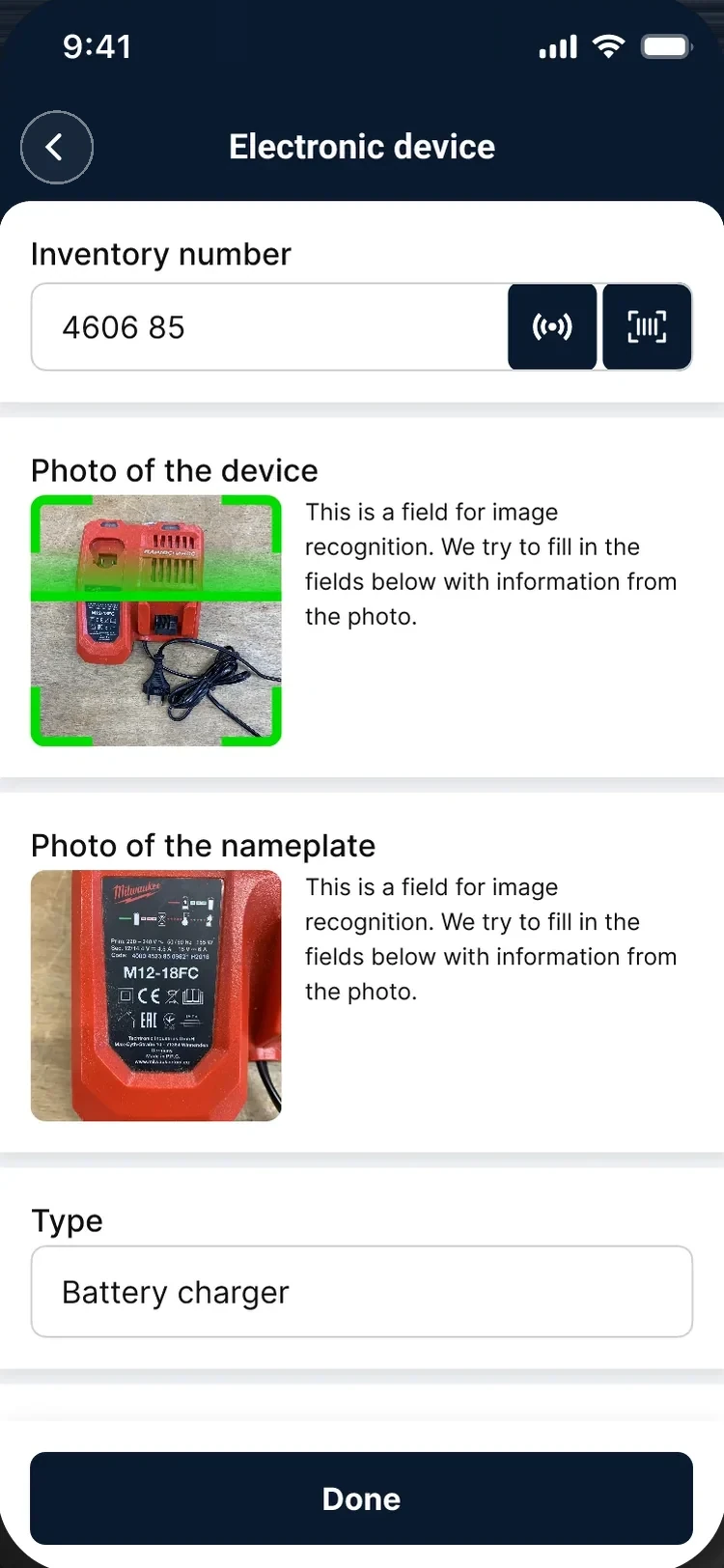
AI · Device testing
The model reads it; the electrician stays in charge
Image recognition takes on the tedious transcription: two photos — the device and its plate — and the fields fill themselves. The design judgement was in the guardrails. The electrician signs the report, so the model can never be the authority: results land in ordinary editable fields, with a highlight showing what was detected. Recognition is a shortcut through the typing — the professional stays accountable for what goes in.
Prefilled values are the biggest single time saving in the product, and they work unseen. An electrician's answers repeat far more than they vary — the same contractor, the same client, the same standard — so they're set once, at workspace or project level, and every documentation inherits them. And real jobs repeat too — circuit after circuit, room after room — so blocks are repeatable. Making that effortless took most of the detail work. It was prototyped, usability-tested on real jobs, then A/B tested and iterated with electricians until it held up in their hands.
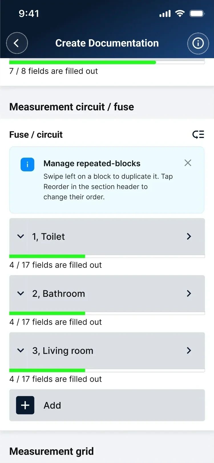
01 · Teach it in place One dismissible hint, exactly where the gesture lives — instead of an onboarding screen nobody reads.
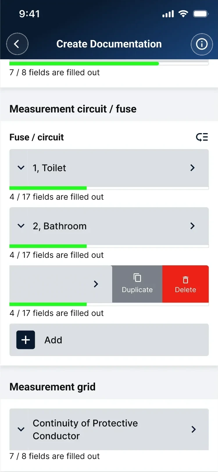
02 · Duplicate in one swipe Duplicate is instant; Delete is the only red element on screen, and always confirmed.
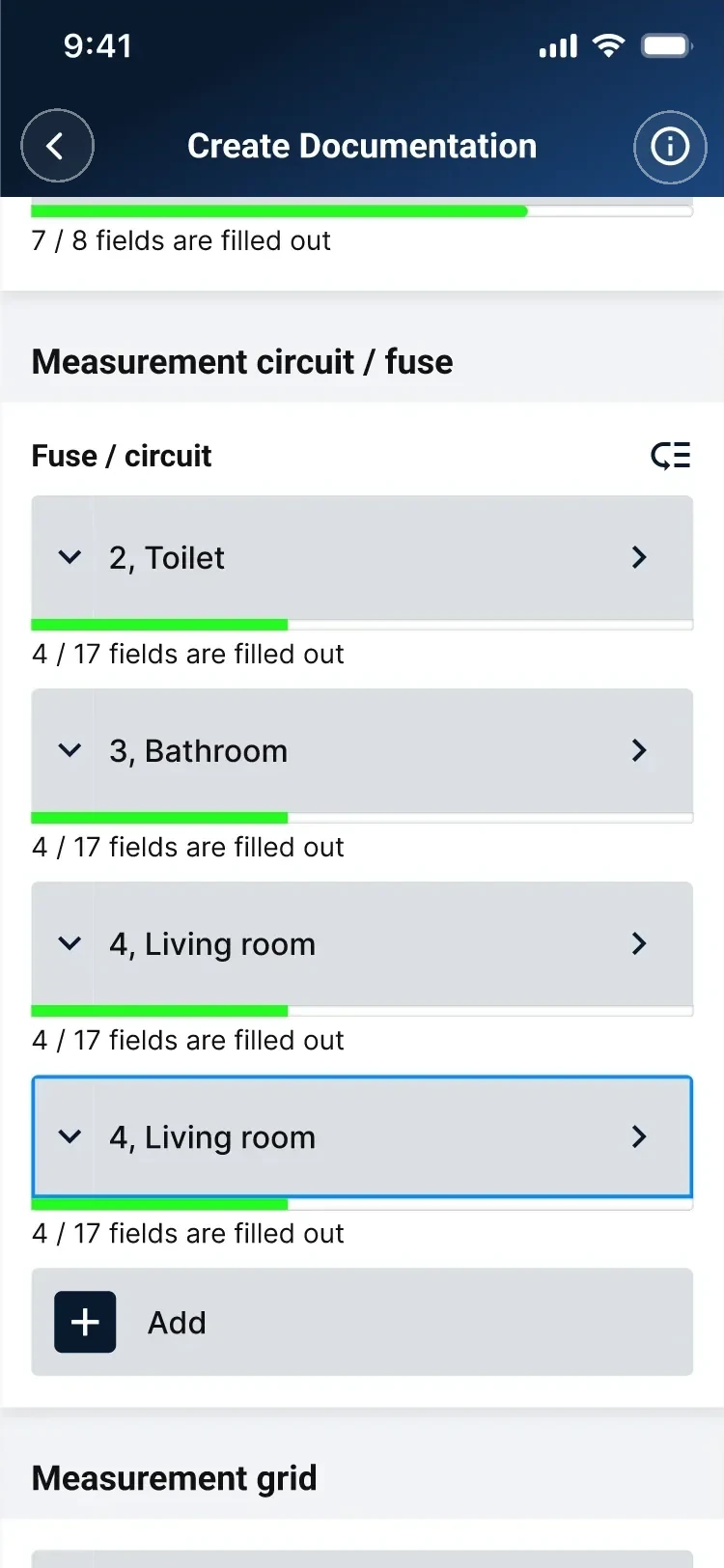
03 · The copy, in place It lands under the original and takes focus. Its label is built from its own values — “4, Living room”, never “Block 4”.
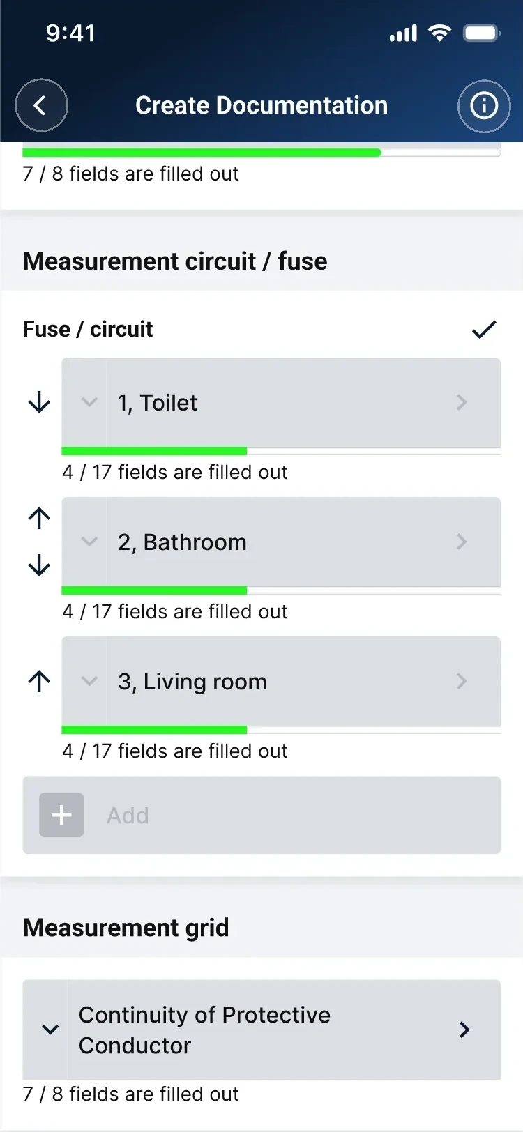
04 · Reorder without dragging Arrows instead — precise with gloves on, impossible to trigger while scrolling.
The payoff, in real product analytics: after this shipped in late June, ~1 in 4 daily documentation-makers were duplicating a block or a whole documentation (peaks ~35%). Current partial week excluded.
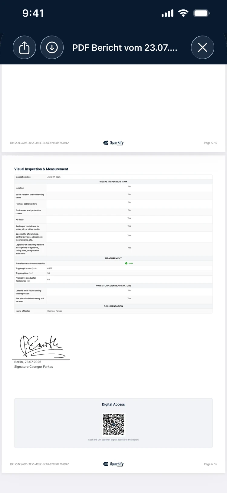
Report · Signature
Handed over before leaving
The job ends on site. Signed on the glass — or pulled from a saved profile signature — the finished PDF carries name, city, date and a QR code for digital access. Either signature can be left empty to sign on paper, because the second is often the customer's and they aren't holding the phone.
05
One system, two brands, every surface
The thing the screens are assembled from — and what kept a product this size consistent.
I made one architectural call early that shaped everything that followed: don't draw screens — build a system and assemble them from it. Colour, type, spacing and radius are Figma variables, and every component references a token, never a hard-coded value. The result is a single published library — 600+ components, consumed on iOS and Android — where changing one token updates every screen that uses it. I also set the system up in Tokens Studio, a common way for teams to keep tokens in sync with code.
Foundations
The point isn't the individual values — it's that one architecture scaled the whole product consistently, and let a second brand ship by swapping token values instead of redesigning screens.
Every value below is a real Figma variable from the published library. Colour, type, spacing, radius — even elevation and blur — are tokens, so components and screens reference the token, never a raw value.
Colour · brand ramp
Colour · text & neutral
The task-colour system
Each documentation task carries its own colour, defined once as a gradient token and reused on its home tile, its header and its report. The design system and the product concept are the same idea.
Type · Roboto headings + Inter body
Spacing scale
Corner radius
Component library · a representative slice
Variant-based component sets, every property bound to the tokens above — one published library, built once, consumed on iOS and Android.
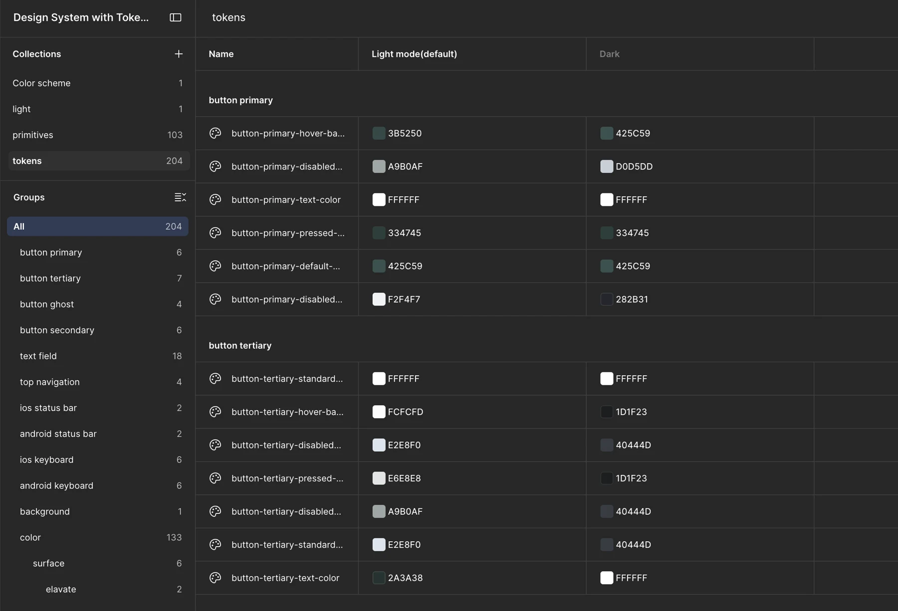
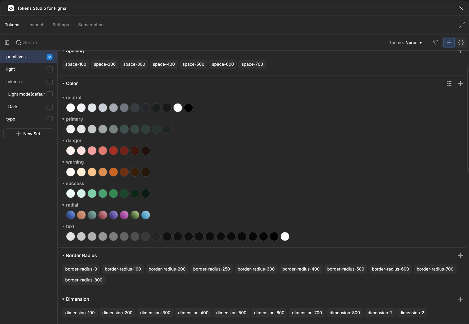
The payoff came with a business decision. The product was built as Onstruc; then Wiha came in behind it and it went to market as Sparkify. Designers from Wiha joined the team through that partnership, and I worked with them and with my co-founder, who is also a designer. I knew a re-theme was coming, so I structured for it from the start — every colour referenced by role, one primary ramp a brand could own. When the rebrand arrived it was a set of new values behind the same variable names: not a redraw.
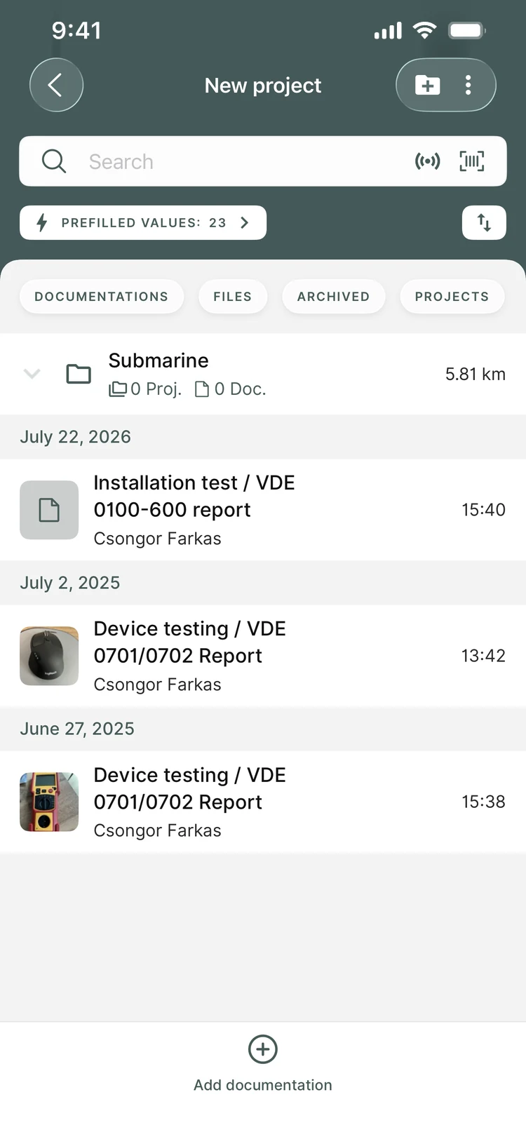
Onstruc · primary/500 · #425c59
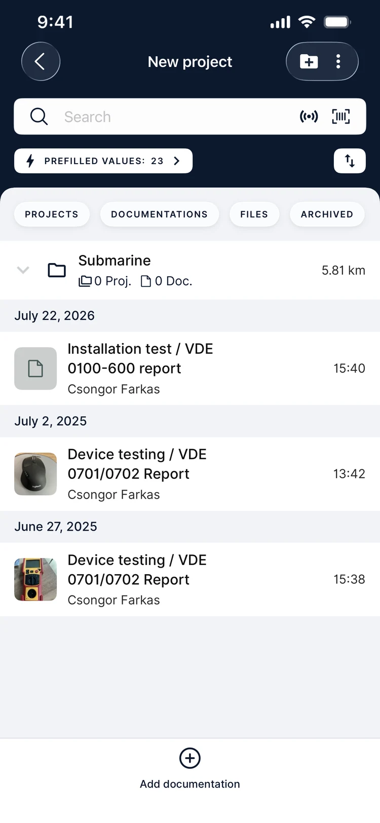
Sparkify · primary/500 · #0a1a2f
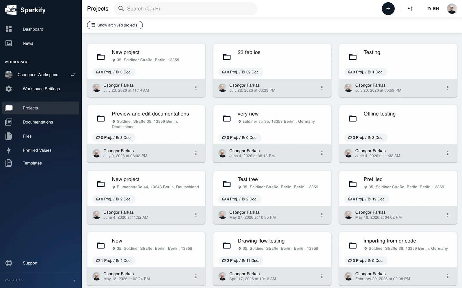
The same library carried the product to the desk. I designed the majority of the web client with Onstruc's CTO — where templates are authored from fourteen field types plus two containers — and the marketing site at sparkify.cloud, so the design language runs from a form on a ladder to the page that sells it.
06
Built for the field
What decides whether a tool survives real use.
Offline by default
Basements and new-builds have no signal. Work continues offline; changes sync on reconnect, and a clear banner tells the user the count they see may be stale.
Roles & permissions
Owner, Manager, User and Guest — assignable per member, at both workspace and project level, with distinct views for admins and guests.
Designed empty & error states
Every list has a purpose-built empty state; every action has success, confirmation and error feedback.
Robust address entry
Search autocomplete, drop-a-pin on the map, or type it by hand — with a graceful fallback when precise/GPS lookup isn't available.
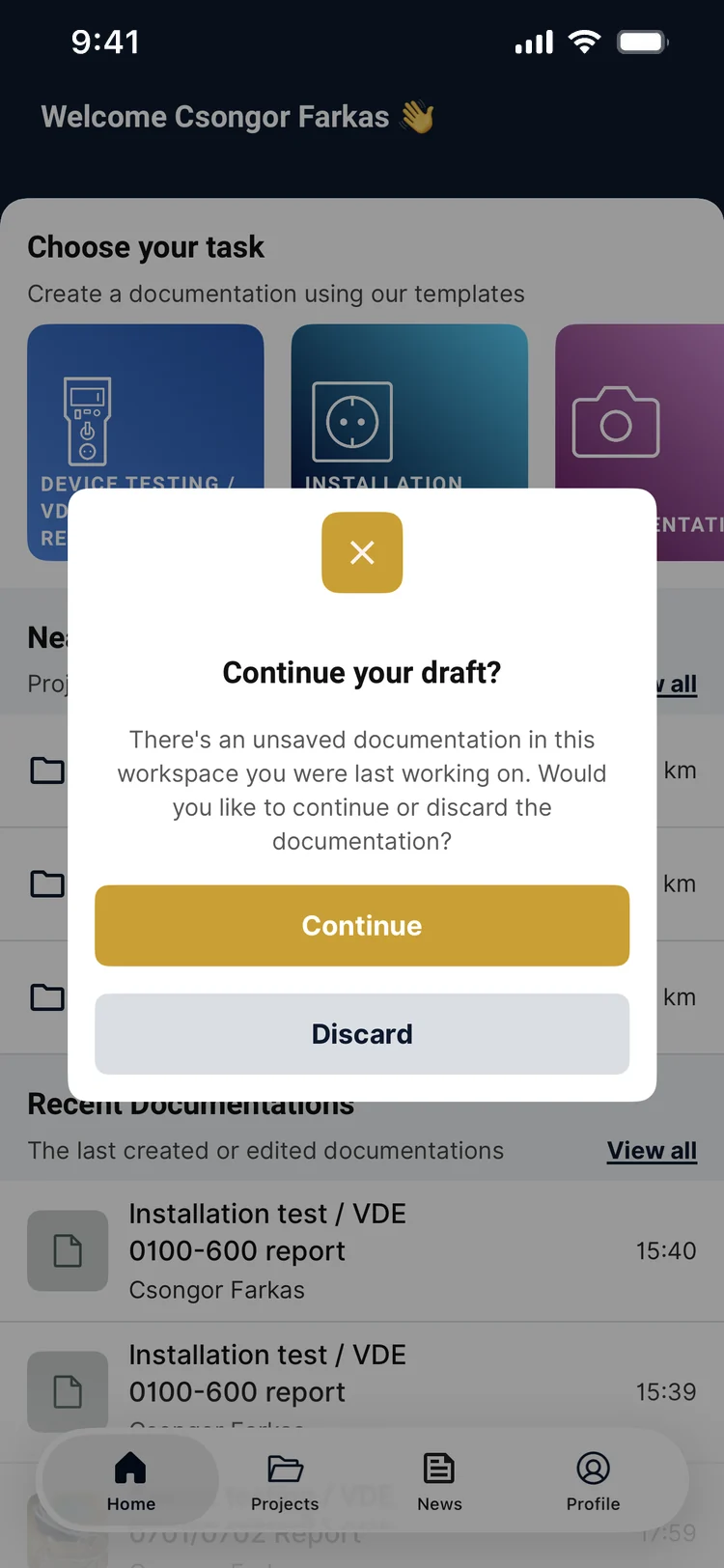
Recovery · Draft state
The safety net for work that gets interrupted
Phones die, overheat, and get closed mid-form. Progress saves automatically as a draft, and returning to the app asks one question on Home, where it can't be missed: continue, or discard. Continue is emphasised, discard is the quiet one — when someone has lost an hour of work, the way back has to be easy to find.
07
Outcome
Live on every platform in 27 languages — a signed report now done on site in minutes.
600
Documentations created a day
The rebuilt product in daily use — 30–60× the old app’s average of 10–20 a day
27
Languages shipped
One task-first structure, localised across the EU
~7 min
From measurement to signed report
Tested by electricians on a full MFT report — the old way ran across days
2,000+
NFC measurement reads a week
From a standing start — the tap-to-read flow I designed
Sparkify shipped. It's live on iPhone, iPad, Android and a browser-based web client, the same documentation synced across all of them, free to download. The rebuild replaced a tool that produced 10–20 documentations a day on average with one shaped around how the work actually happens: from the first measurement on site to a signed PDF, without retyping. The app has passed 1,000 downloads on Google Play and is rated 4.9 across its first reviews. And because it runs on a tokenised system, the team keeps shipping — new templates, a second brand, hardware and planning-tool integrations — without redesigning the app each time.
The result. The old way ran across days: measure on site, note it on paper, transfer it at the office, fix what got mistyped, compose the report, send it. With the tester talking to the phone and the template already shaped like the standard form, a full MFT report is now filled out, signed and handed over on site, in roughly seven minutes — measured in tests with electricians running the job, not estimated.
Real product analytics, Apr–Jul 2026 — roughly 600 documentations created a day. The measure the rebuild was judged on: the old app averaged 10–20 a day.
Real product analytics, Mar–Jul 2026 (the current partial week is excluded). Adoption of the tap-to-read NFC flow I designed — from a standing start to 2,000+ events a week.
Sparkify Documentation


The rebuild started from one idea: the structure users needed already existed in their trade, not in the software. The rest of the product follows from that.
More work
View all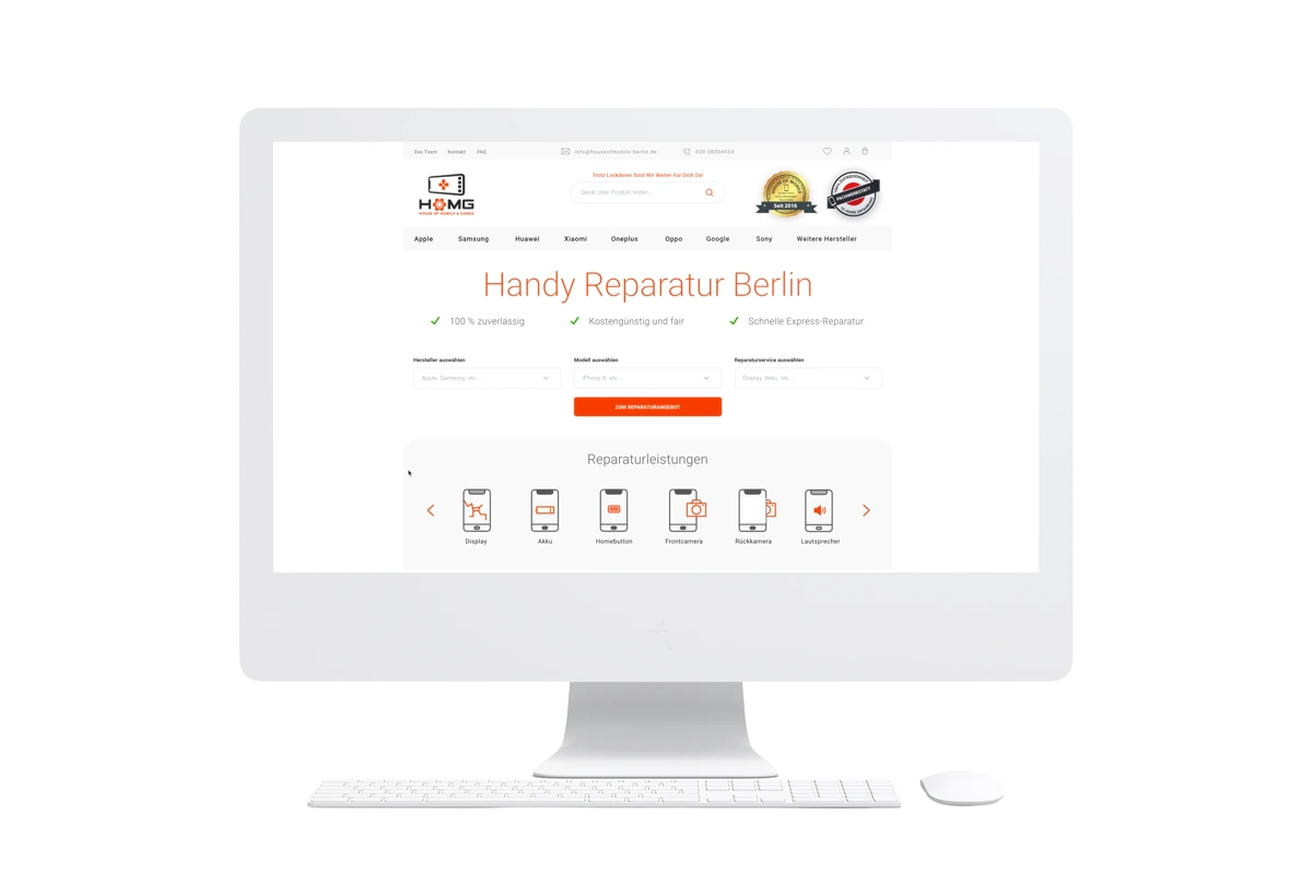 House of Mobile & GamesRedesigning an e-commerce homepage and lifting conversions by 46%
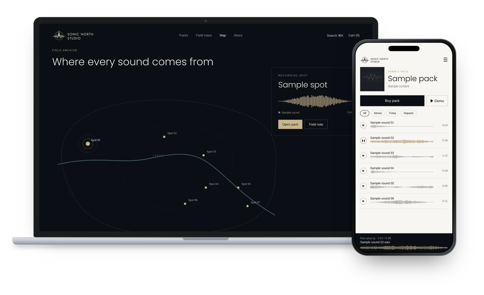 Sonic North StudioWork in progressDesigning a sound shop around listening: brand, site and audio player
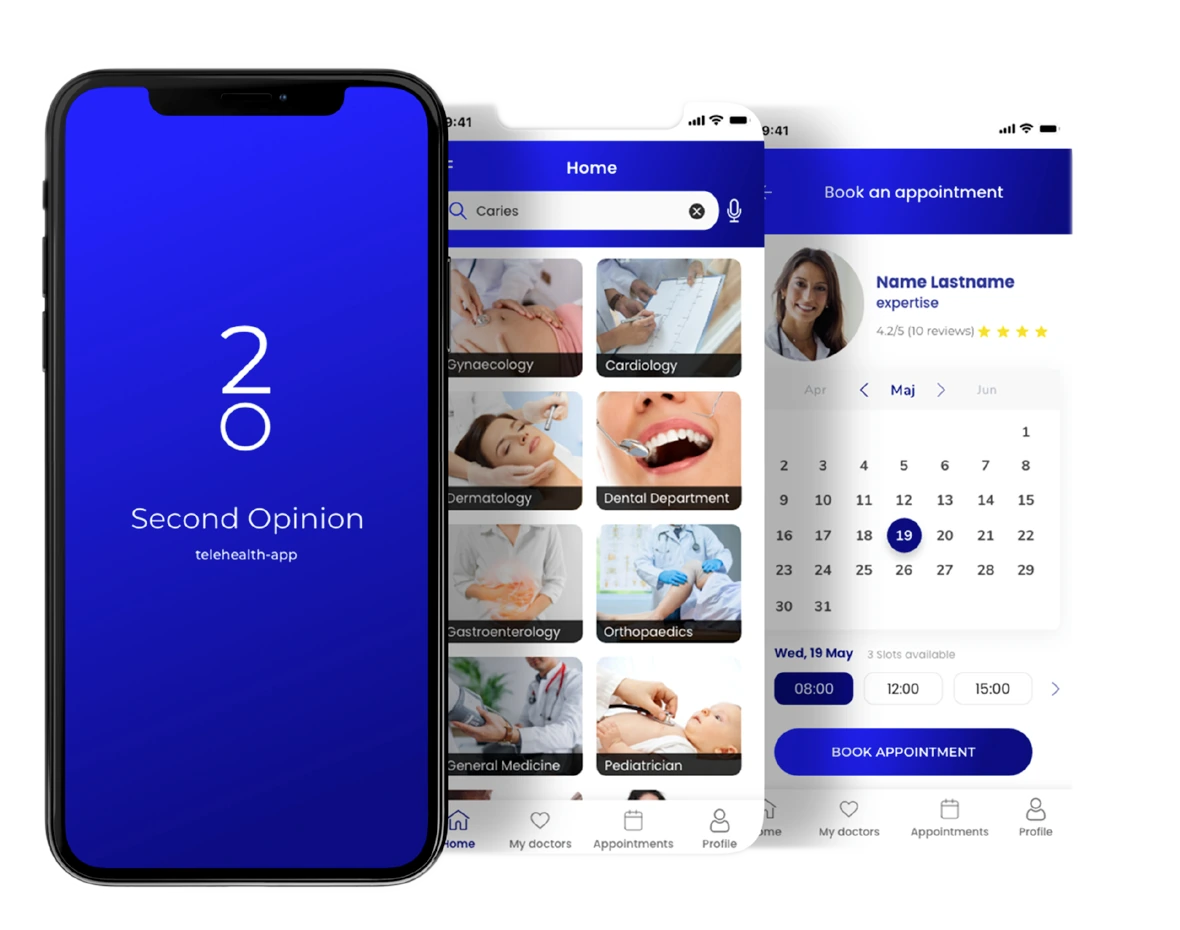 Second OpinionGetting a patient to trust a doctor they have never met
 Social Skills AnimationTurning social stories into animations a therapist can build inside a session
 Kinderleichter ArbeitsschutzGiving a safety-services business its first digital product
 Junge FreiheitMaking a decades-old publication legible again online