WorkKinderleichter Arbeitsschutz
Giving a safety-services business its first digital product
Kinderleichter Arbeitsschutz keeps Kitas, after-school clubs and schools safe and legal — on site, in person — every service it sold depended on someone being there. As Product and UX/UI Designer, I owned it end to end — research through to shipped UI — and designed the platform that gave the business something to sell online for the first time: one structure covering four service areas, a shop, bookable seminars, and a members' area where customers take the course themselves.
My role
- UX research
- Competitor analysis
- Card sorting
- Information architecture
- User-flow design
- Mobile-first UI
- High-fidelity prototypes
- Usability testing
The team
- CEO & Management
- Frontend & Backend Developers
- Product Management
Deliverables
- Sitemap & user flows
- Mock-ups & prototypes
- Design language
- Component library
- Build-ready specs
01
A services business with nothing to sell online
Two websites, four service areas, and no way to buy or learn anything without a person in the room.
The business ran on expertise delivered in person: risk assessments, playground inspections, fire-safety plans, staff briefings. That expertise was described across two separate websites, and neither of them could take a payment. A customer could read about a service — and then had to pick up the phone.
The knowledge was the product — and there was no way to buy it without booking a visit.
So the brief was not really “merge two websites”. It was: give this business a digital product, and build the structure a customer travels through to reach it. Consolidation was the precondition — a self-paced course and a members' area only make sense once there is one place they can live.
Four service areas
Arbeitsschutz
Occupational safety — assessments, consulting, staff briefings
Kindersicherheit
Child safety — playground inspection, first-aid courses
Brandschutz
Fire safety — fire-safety regulations for the premises
Hygiene
Hygiene plans for shared childcare environments
These four are the spine of everything downstream. They already existed in the business, and they already existed in the logo — an umbrella with the four areas set around it, each in its own colour. The platform puts that colour system to work: it is how you know where you are.

02
One structure
Card sorting, then three decisions that shaped every page on the platform.
Decision 1 — the services carry the site
Rather than following page types, the architecture follows the four service areas the business actually sells. Each opens into its own set of offers — Arbeitsschutz alone holds six, from consulting to automated staff briefings. The same four appear in the mega-menu, the mobile menu, the homepage and the button set, so a customer learns the structure once.
Decision 2 — pages you compose vs. pages that behave
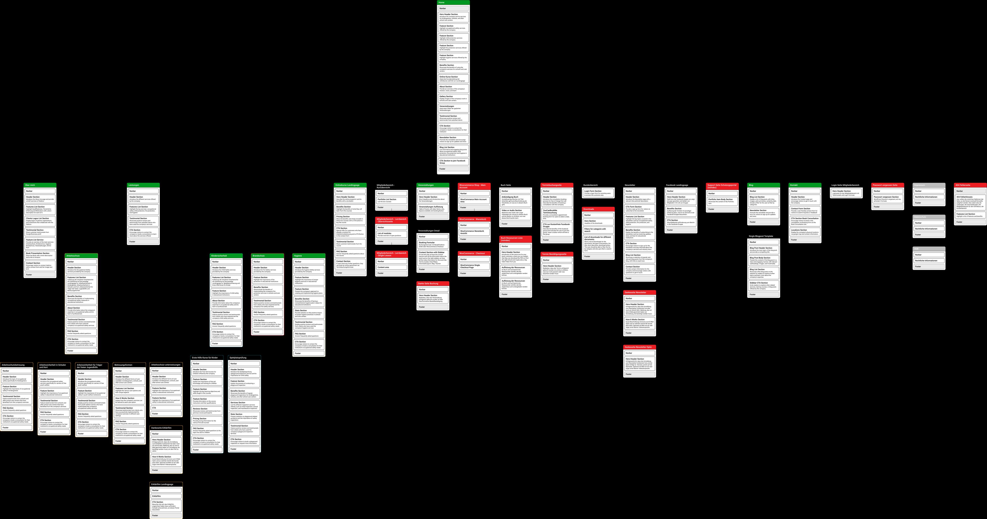
I mapped every page in the platform down to its section stack, then split the pages into two kinds. Content pages are compositions — hero, features, benefits, FAQ, CTA — assembled from the same sections, so the client can build new ones without me. System pages are not: cart, checkout, booking confirmation, the learning area, password reset. Those behave rather than compose, and they were specified separately.
Decision 3 — every path ends somewhere
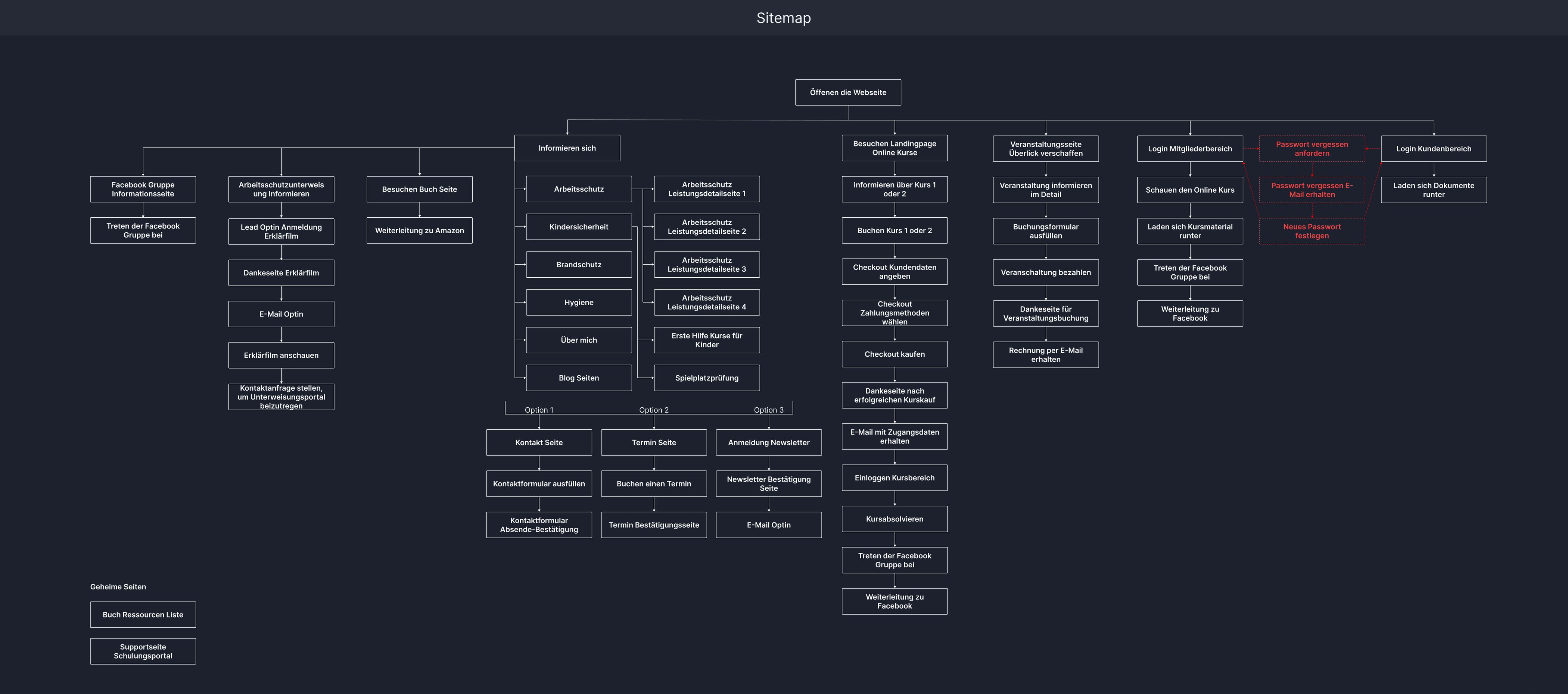
The flow map sets out how someone moves through the platform: informing themselves across the four areas, then taking one of three routes out — contact, book an appointment, or subscribe — each with its own confirmation. Alongside them run the two paths that were new: buying a course, and booking a seminar seat.
03
Finding your way
Around twenty offers across four areas — on a desktop mega-menu, and on a phone.
Desktop — the whole offering at once
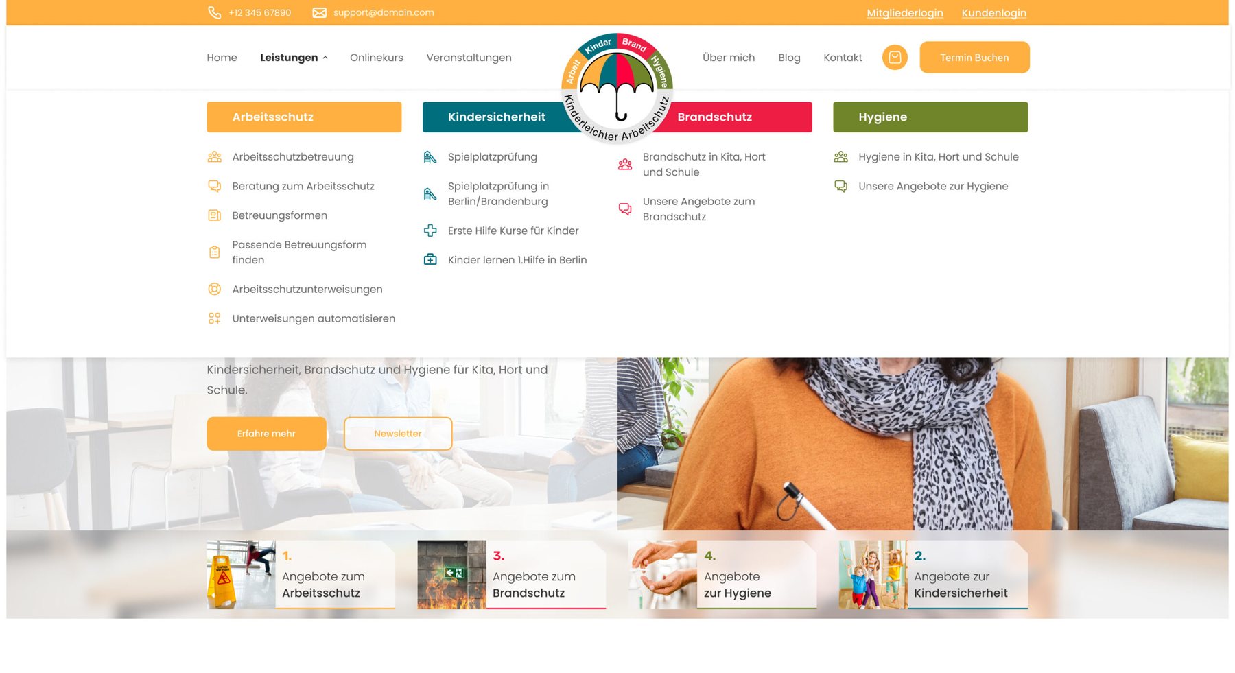
The mega-menu shows all four areas side by side, each under its own colour, each service with its own icon. One glance covers the entire catalogue. The header carries both entrances to the paid side — Mitgliederlogin for the course area, Kundenlogin for documents — plus the cart and a booking CTA, so the commercial routes stay in reach without crowding the editorial nav.
Mobile — the same tree, three levels deep
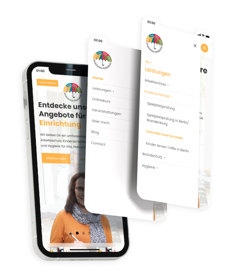
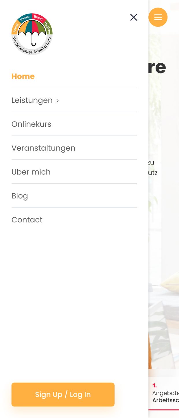
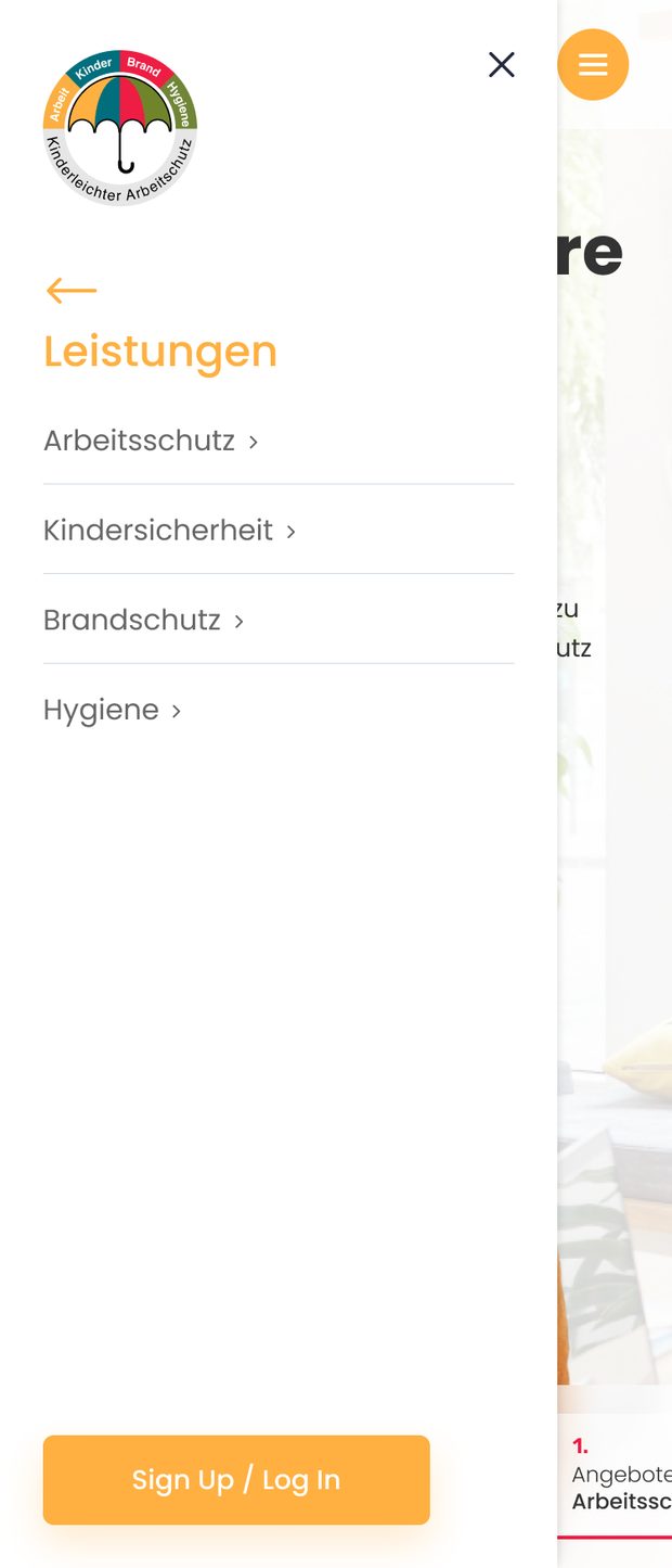
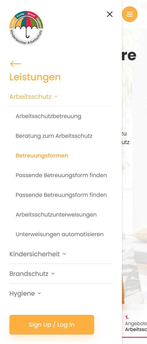
A mega-menu does not survive a phone screen. Instead of flattening the catalogue or burying it in accordions, the mobile menu drills down one level at a time: main menu, then the four areas, then the services inside one. A back arrow and the parent name as a heading keep you oriented, the active branch takes its service colour, and Sign Up / Log In stays pinned to the bottom at every level — so the route into the paid product never disappears mid-navigation.
The homepage
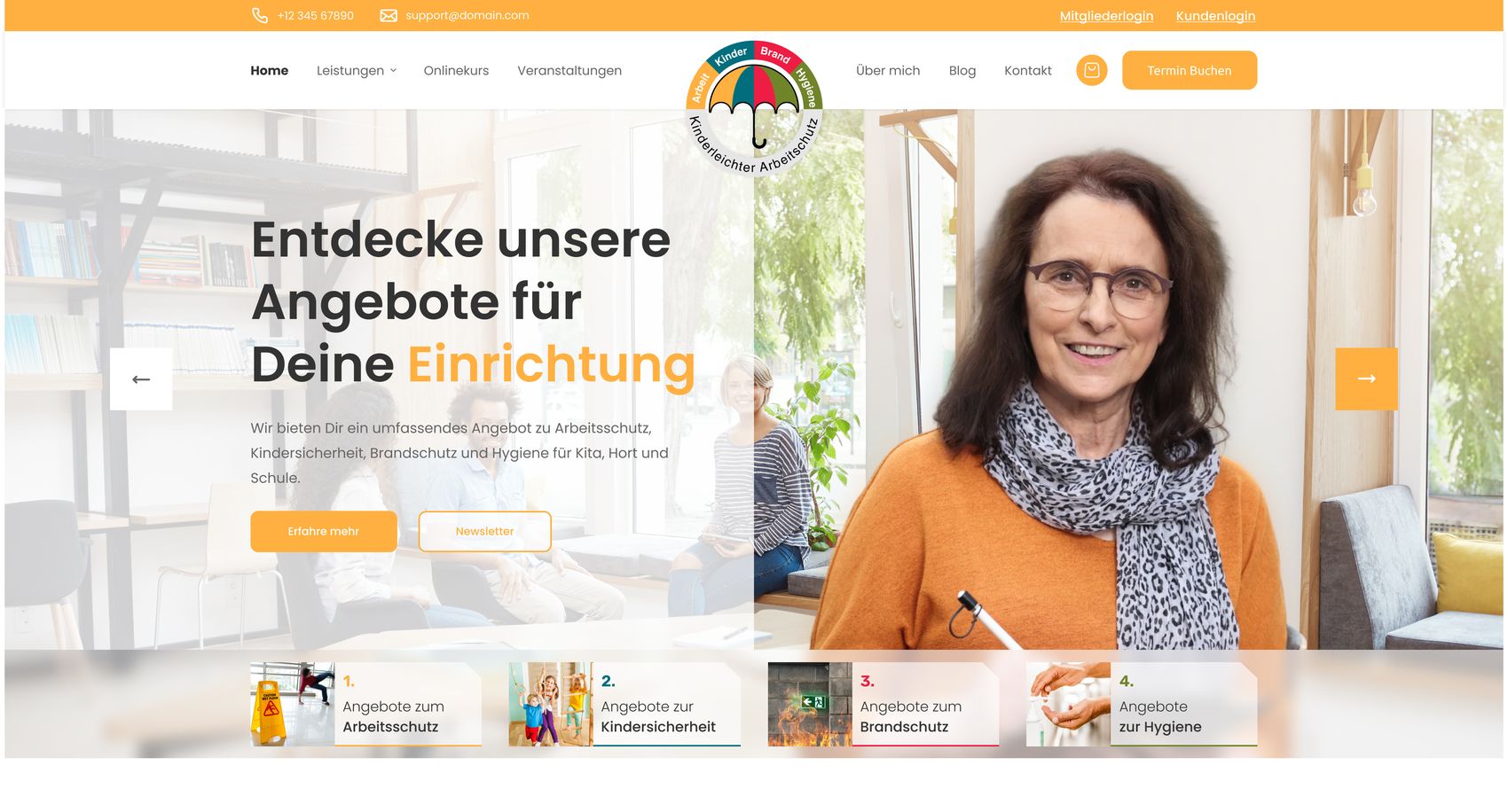
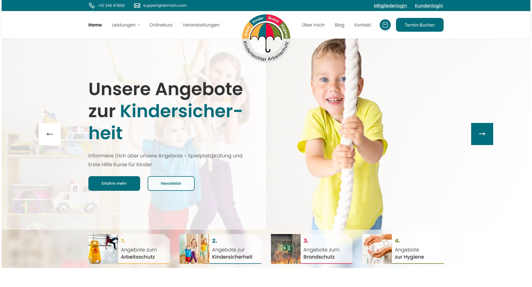
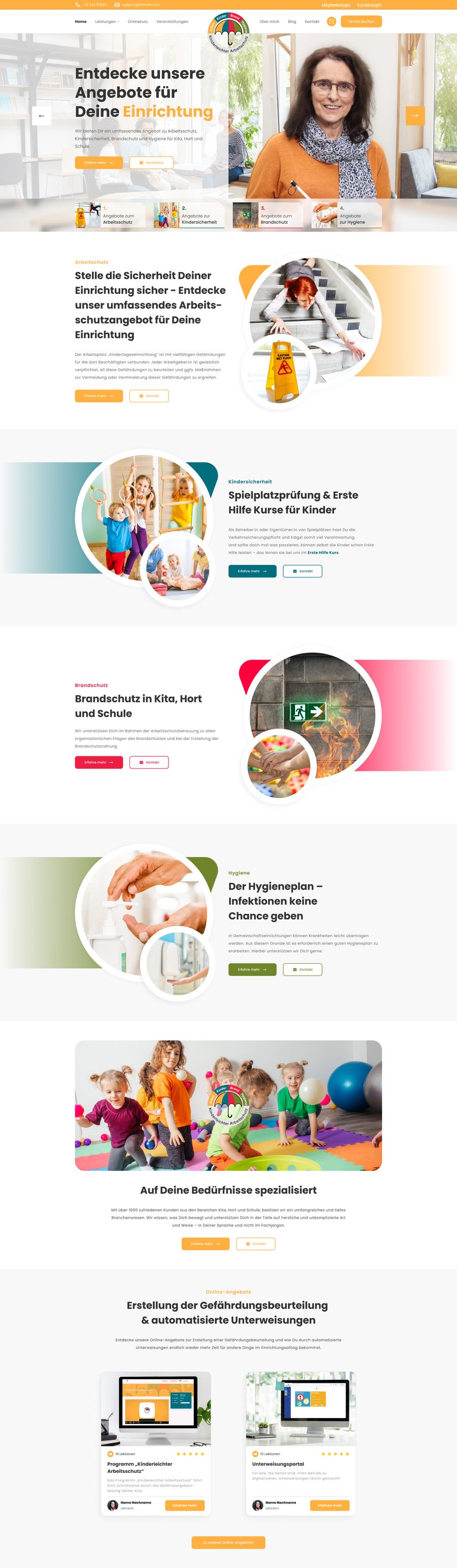
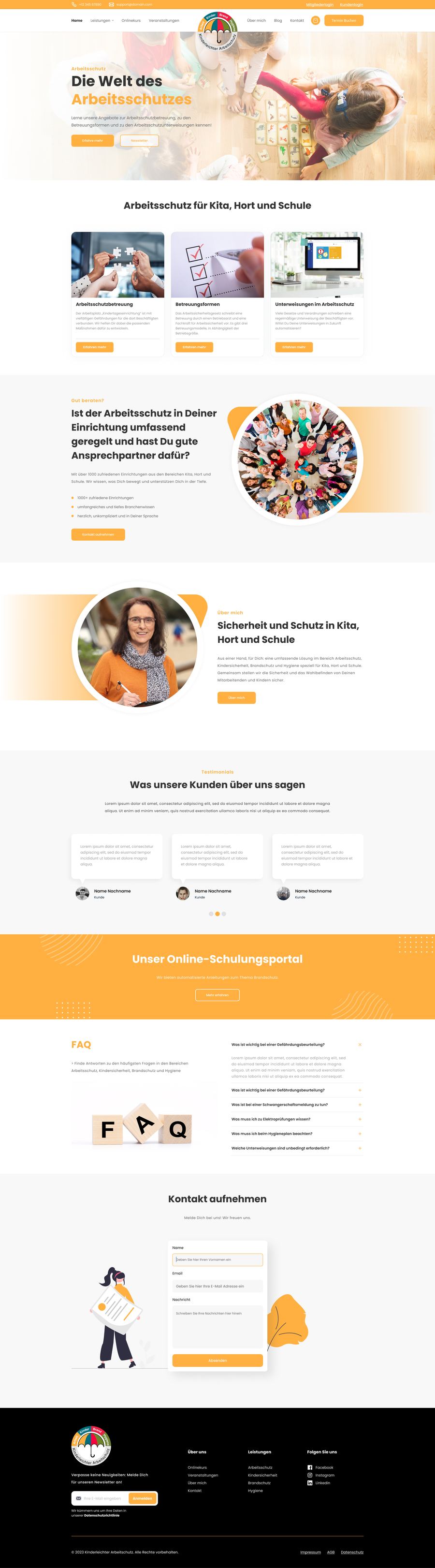
The homepage opens on a slider that introduces the four areas in turn, each taking over the page in its own colour — so the first thing a visitor learns is the shape of the offering.
04
Discovery to purchase to learning
The part that did not exist before — and the handoffs where it could have broken.
- 01DiscoverA service area, or the course that solves the same problem
- 02DecideOffer detail — price, dates, seats, what you leave with
- 03BuyCart and checkout, for a course, a seminar seat or a document
- 04Get accessConfirmation, then credentials by e-mail
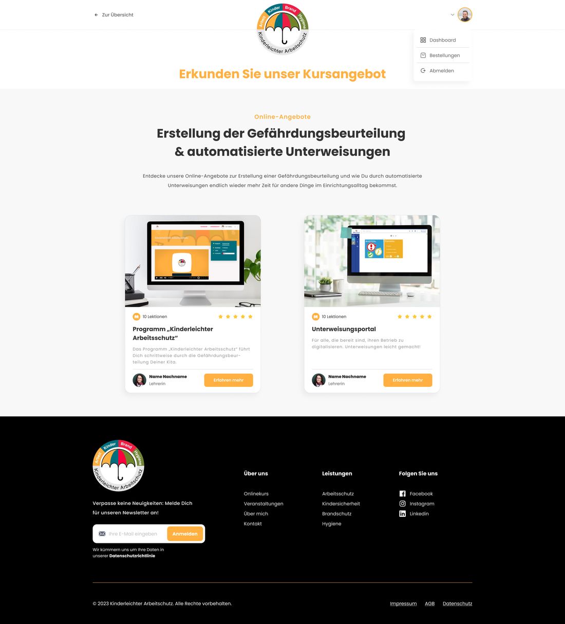
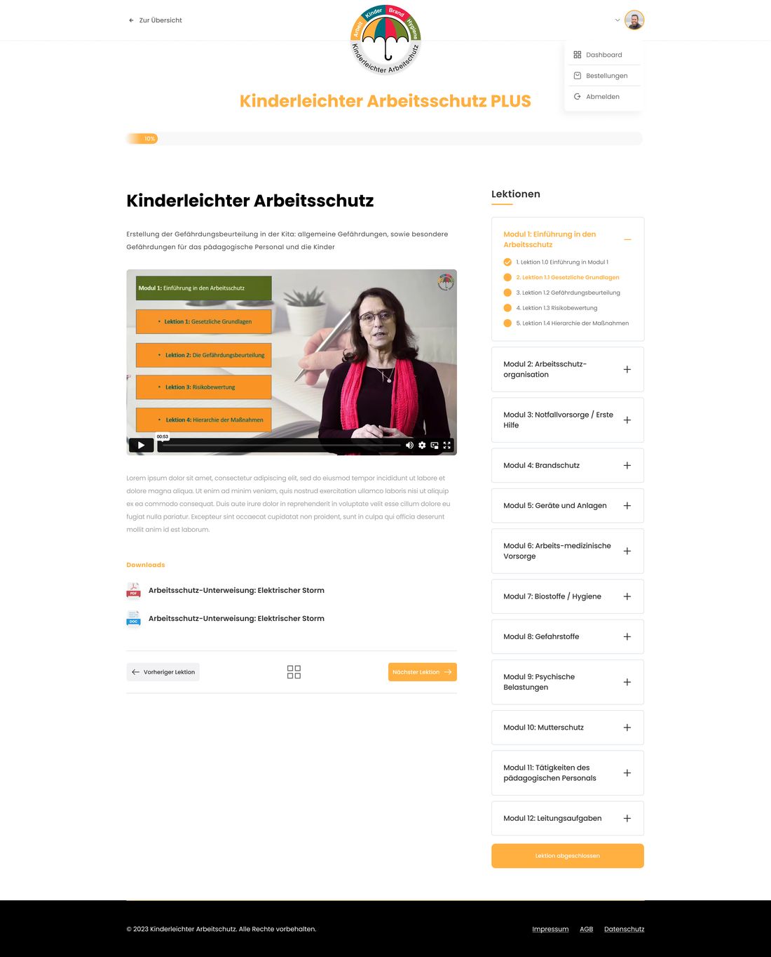
- 05LearnMembers' area — course overview, learning area, lessons
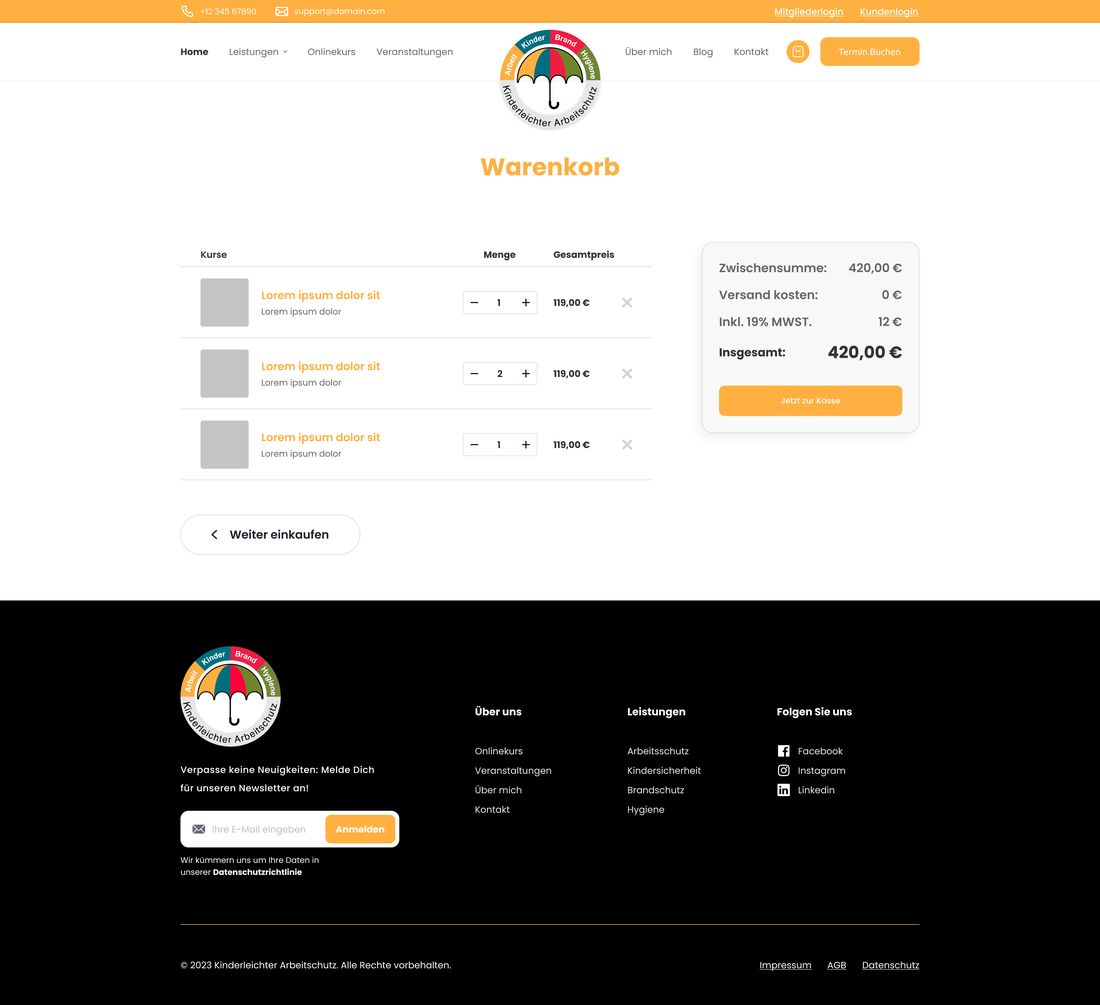
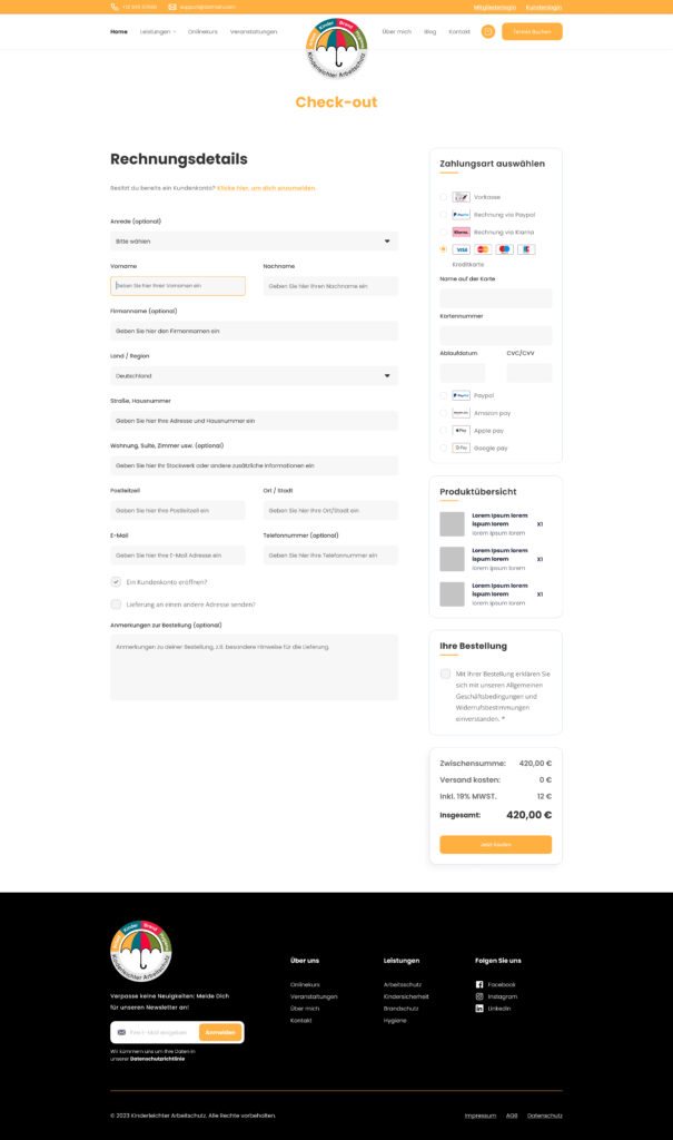
Five steps, and the design work is in the joins. Buying is where consolidated platforms usually give themselves away: you check out on one system and get dropped into another that looks nothing like it. Here the checkout, the confirmation and the members' area are built from the same component library as the marketing pages, so the seam is not visible.
Buying — three things, one checkout
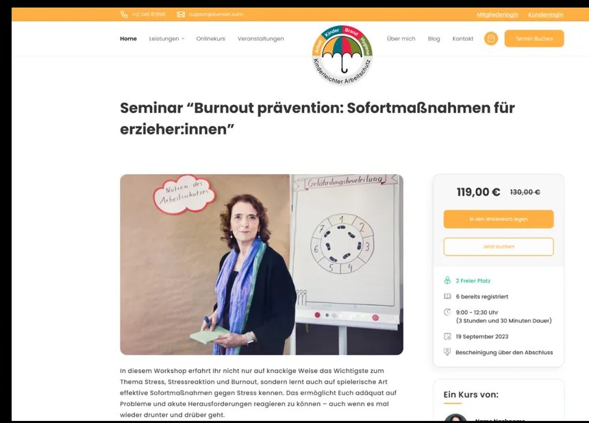
The platform sells a self-paced course, seats at dated seminars, and downloadable documents — three different kinds of thing through one WooCommerce checkout. The seminar template carries the constraints that come with a real room: price, seats left, how many have already registered, duration, date, and the certificate you leave with. Both “add to cart” and “book now” are offered, because a Kita ordering for its staff and an individual signing up behave differently.
Learning — the members' area
After checkout, credentials arrive by e-mail and the customer enters the members' area: a course overview, the learning area, and the individual lessons that walk a Kita through its own risk assessment step by step. This is the product the business did not have.
05
One design language
A component set the client could keep building with after I left.
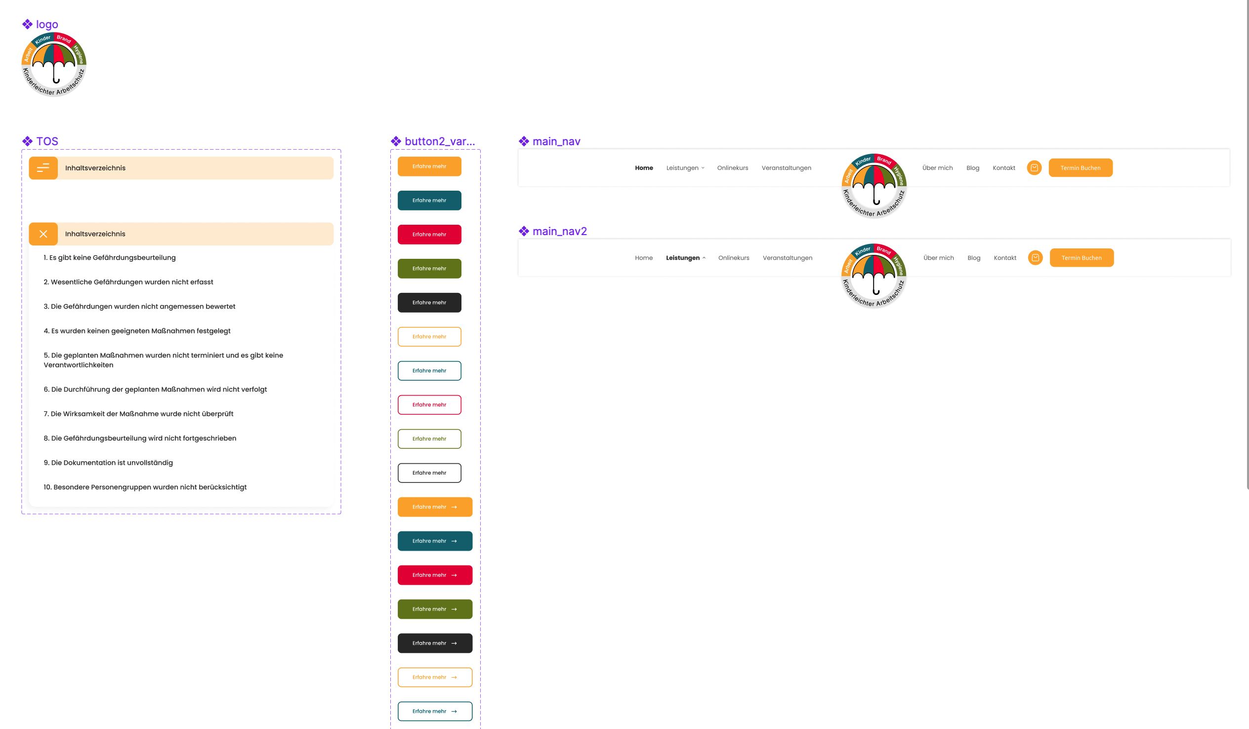
The colour system is the load-bearing part. Every component that can belong to a service area has a variant per colour — buttons come as a matrix of four service colours across filled and outline, with and without an arrow — so a Brandschutz page is built from Brandschutz components rather than recoloured by hand. Navigation ships in default and active-section variants, and the category card is one component in four service colours.
The platform runs on WordPress and WooCommerce, and the client maintains it in-house. That set the constraint on the whole system: components had to map onto what the page builder could actually assemble, and content pages had to be composable from a fixed set of sections. A design the client could not extend would have started decaying the week after launch.
Assembled
06
Outcome
One platform, live, running the parts of the business that used to need a person.
Zero to one
The business's first digital product
Services, a shop, seminar booking and a members' area in one structure
Two to one
Websites consolidated into one platform
Both previous sites replaced at launch
Four areas
One structure across every service the consultancy sells
Arbeitsschutz, Kindersicherheit, Brandschutz, Hygiene
Still live
The platform the business runs on
Bookings taken against real seminar capacity
The platform replaced both previous websites and launched carrying four service areas, a shop, a seminar-booking system, a members' area and a blog. It is still the platform the business runs on: the events calendar takes bookings against real capacity, and the online course reaches the same Kitas, after-school clubs and schools the consultancy already served — a customer base the client puts at over a thousand institutions.
What changed is what the business is able to sell. Expertise that previously had to be delivered in person — a risk assessment walked through on site, a briefing given in a room — is now also a product a customer can buy and work through on their own.
More work
View all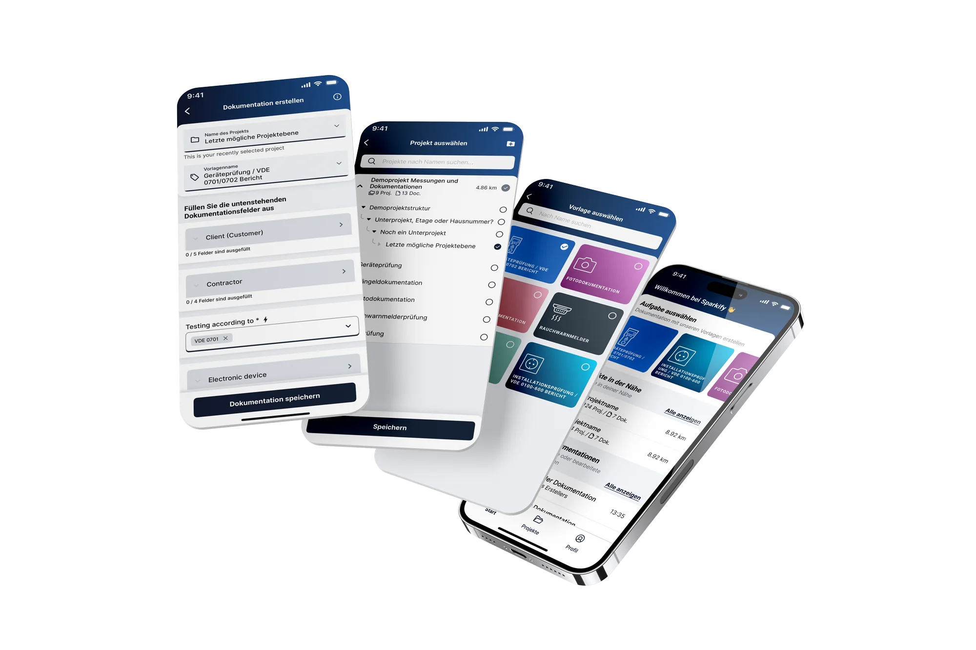 SparkifyRebuilding a field-documentation app from scratch — and the design system behind it
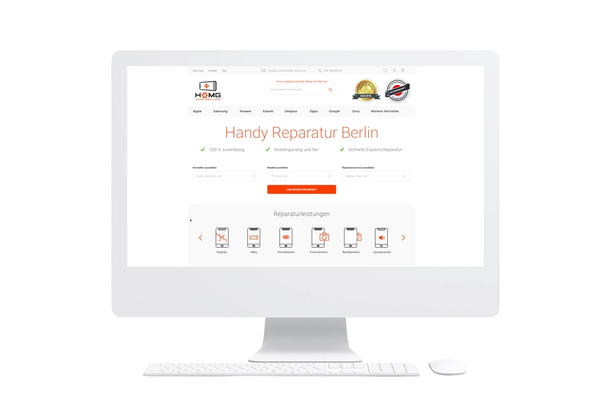 House of Mobile & GamesRedesigning an e-commerce homepage and lifting conversions by 46%
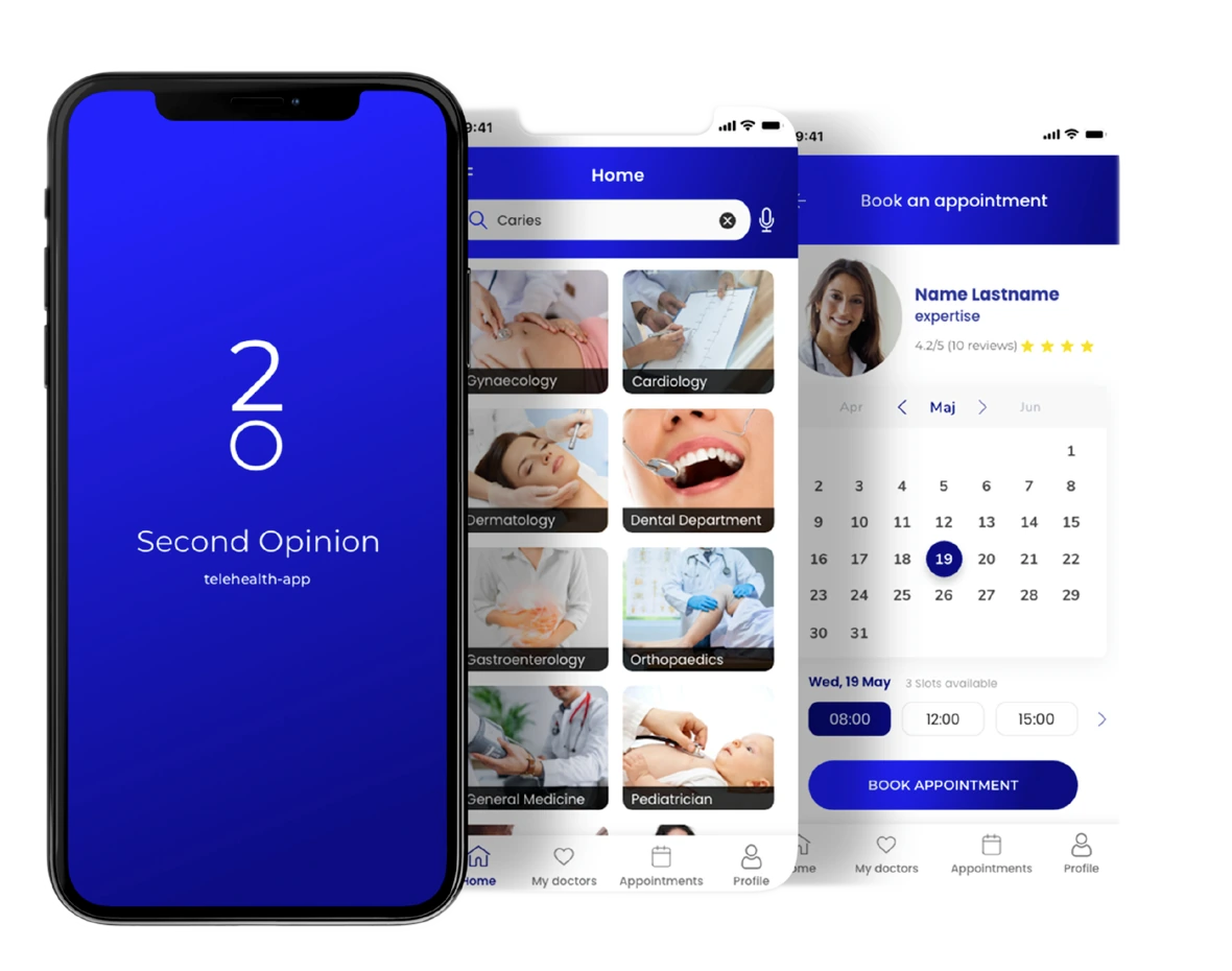 Second OpinionGetting a patient to trust a doctor they have never met
 Social Skills AnimationTurning social stories into animations a therapist can build inside a session
 Junge FreiheitMaking a decades-old publication legible again online