WorkJunge Freiheit
Making a decades-old publication legible again online
Junge Freiheit is a German weekly, in print since 1986. Its website was no longer bringing in the traffic or sign-ups that management expected — and the interviews found the reason was not that it looked dated. Readers did not trust what they were reading; some took the articles for advertising. As Product and UX/UI Designer, I owned it end to end — research through to shipped UI — redesigning the homepage, category and article templates around that problem, and the new design won its A/B test against the existing site.
My role
- UX research
- Competitor analyses
- User-flow improvements
- Low-fidelity prototypes
- Mid-fidelity prototypes
- High-fidelity clickable prototypes
- A/B testing
The team
- CEO & Management
- Frontend & Backend Developers
- Product Management
Deliverables
- Reader interviews
- Site map & templates
- Mock-ups
- Prototypes
- Test results
- Design-language update
01
What the research found
Usability tests and interviews on the live site — and a finding that reframed the whole project.
The brief
Management asked for a redesign of the primary pages, the category-page template and the single-article template. The stated problem was business-side: the site was not converting. Rather than start from the layout, I ran usability tests on the live page with follow-up interviews to find out what readers were actually experiencing.
The finding that reframed the project
Readers did not trust the content — and perceived it as sponsored.
That is not a styling problem. A publication that has been in print since 1986 was being read as advertising, and once I looked at the page with that in mind, the layout explained it. From there the work stopped being a visual refresh and became a question of making the publication legible: what is JF's own reporting, where am I, and what is worth my time.
Three problems
01
The page didn't read as the publication's own
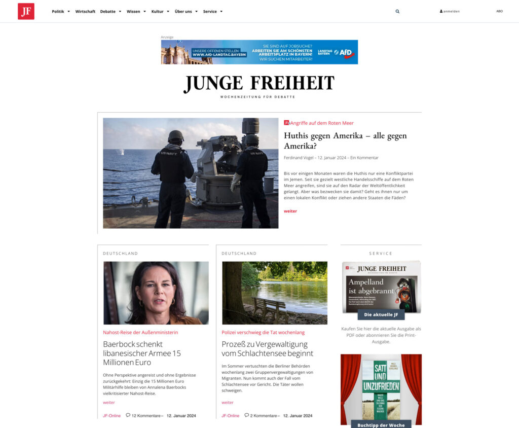
Readers said they did not trust the content and took it for sponsored placement. The layout explained why: a third-party ad banner sat above the masthead — the first thing on the page, before the title of the magazine itself — and a Service column mixed shop items and subscription offers directly into the editorial grid. Nothing on an article marked it as JF's own reporting.
02
Nothing told you where you were
The visual organisation was described as confusing and overwhelming. Categories were set in small grey capitals at almost no contrast, the navigation mixed editorial sections with corporate ones, and the homepage was an undifferentiated run of cards with no named sections.
03
Readers couldn't judge an article or keep it
Readers were unsure what to expect from the page. There was no indication of how long a piece would take, no way to save one for later, and the only route onward from an article was back to the menu. Subscription was present but easy to overlook as a value proposition.
Voice of the user
“As a user, I would like to be able to distinguish easier all the categories that are displayed, to see the reading times of the articles and be able to save them, so I could read them later.”
Three requests in one sentence. All three ended up in the design — visible in the before/after comparisons further down.
02
What I decided to change
Three principles, one per problem — the rules everything downstream had to satisfy.
Let the publication sign its own work
Credibility had to be visible on every article, not tucked away on an About page.
Make the structure do the explaining
Reduce the cognitive effort of the homepage by naming its sections, so readers can see what the site holds without opening the menu.
Give readers the two controls they asked for
Reading time and save-for-later, on every article — plus clear internal paths onward instead of dead ends.
Reference points
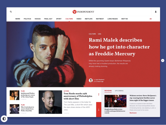
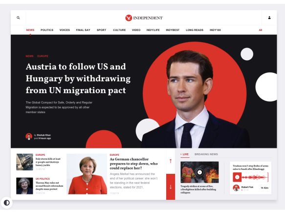
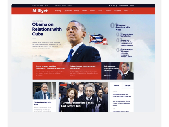
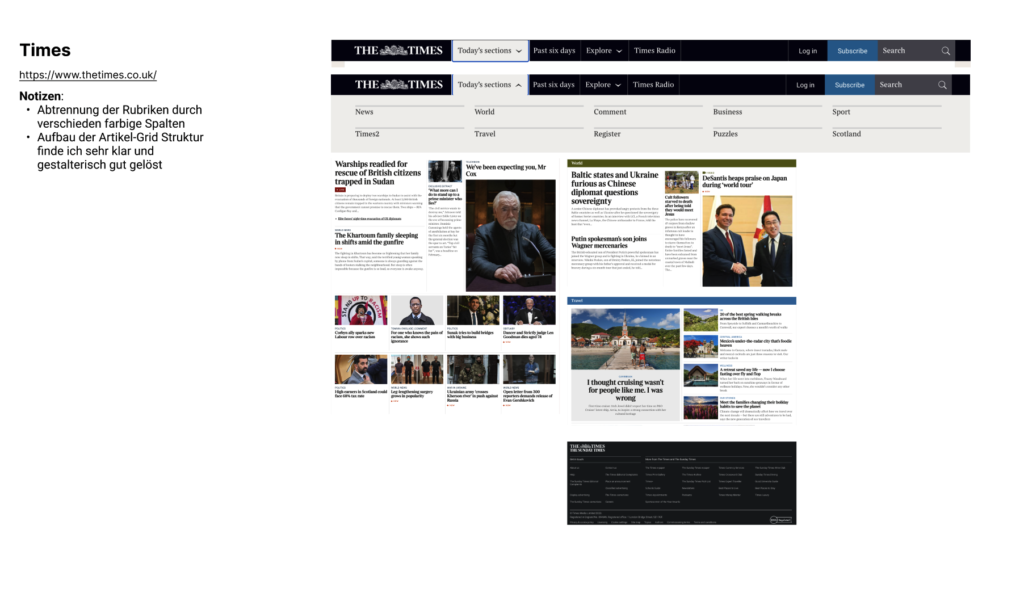
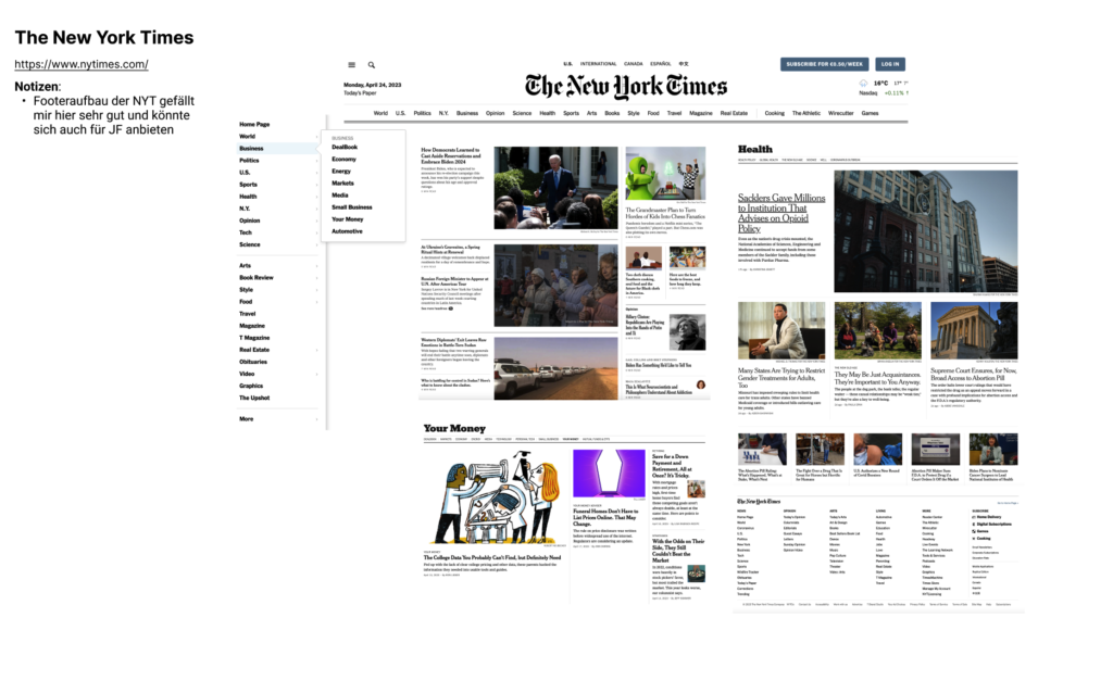
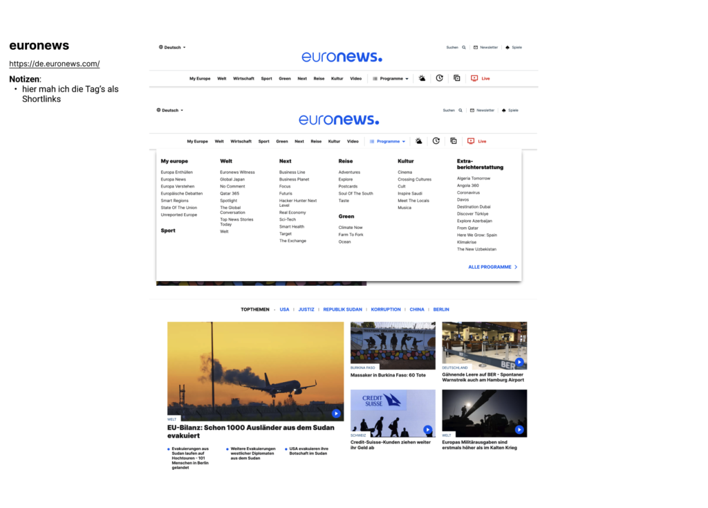
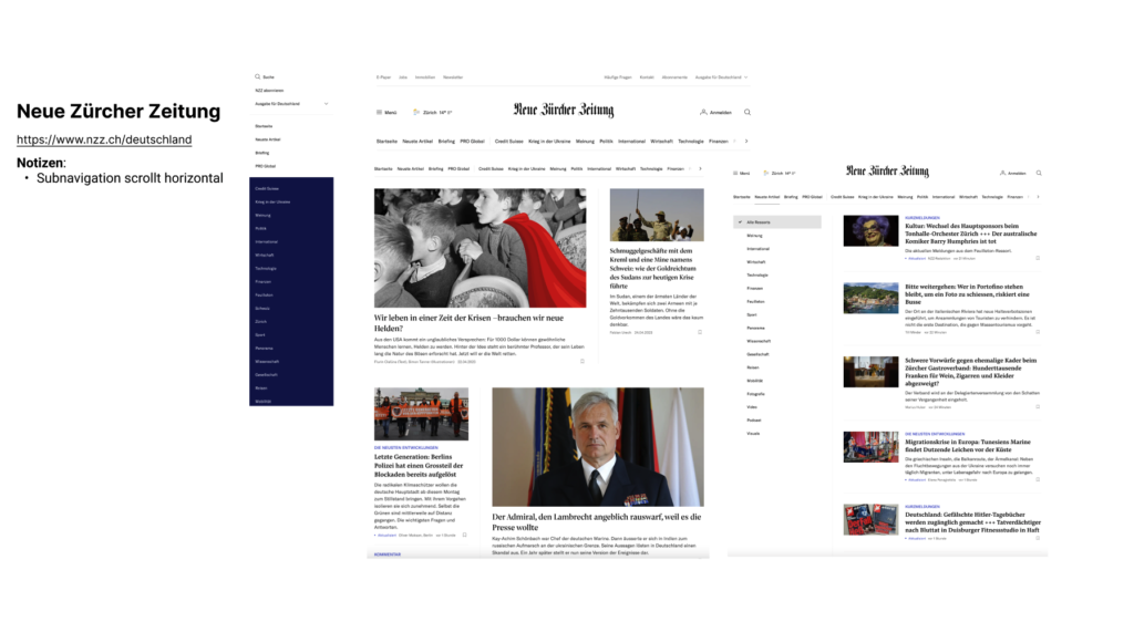
I reviewed how other news and magazine sites — German and international — handled the same three problems: how they marked their own reporting, how they labelled sections, and what metadata they put on an article card. That fed a short mood board, which was the fastest way to agree tone, typography and colour with the client before any layouts were drawn.
03
Structure & grid
Before any visual detail: a responsive grid and a set of named modules to build the pages from.
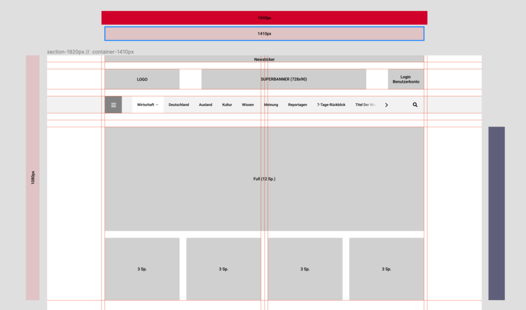
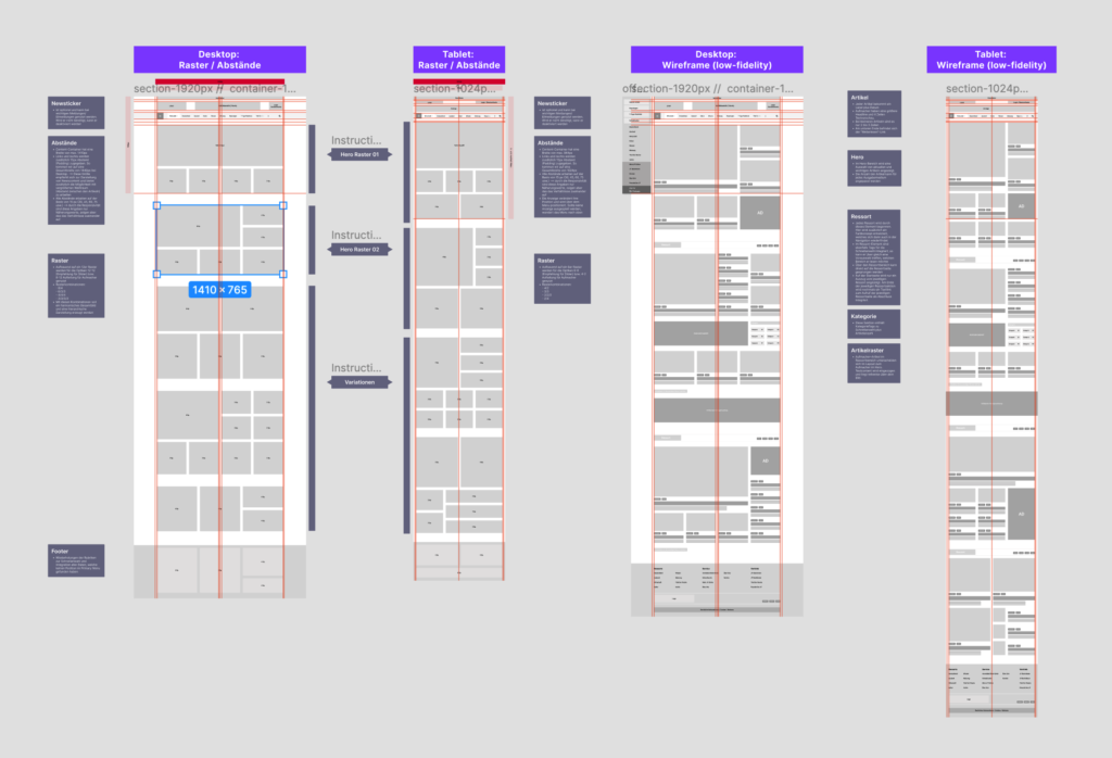
The homepage needed named sections and a predictable rhythm, so the first thing to settle was the frame. I specified a 1410px container on a twelve-column grid inside a 1920px section, and worked the layout through desktop and tablet breakpoints in parallel rather than designing one and adapting it afterwards.
The wireframes are annotated by module — hero, Ressort, Kategorie, Artikelraster, newsticker, footer — with spacing rules written next to each. Naming the modules at this stage is what made the design system straightforward later: by the time I reached visual design, the page was already a set of repeatable parts rather than a one-off composition.
04
The redesign
Each change traced back to the finding that caused it.
The top of the page
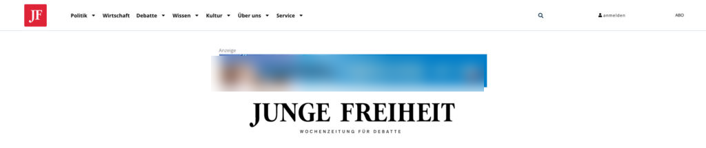

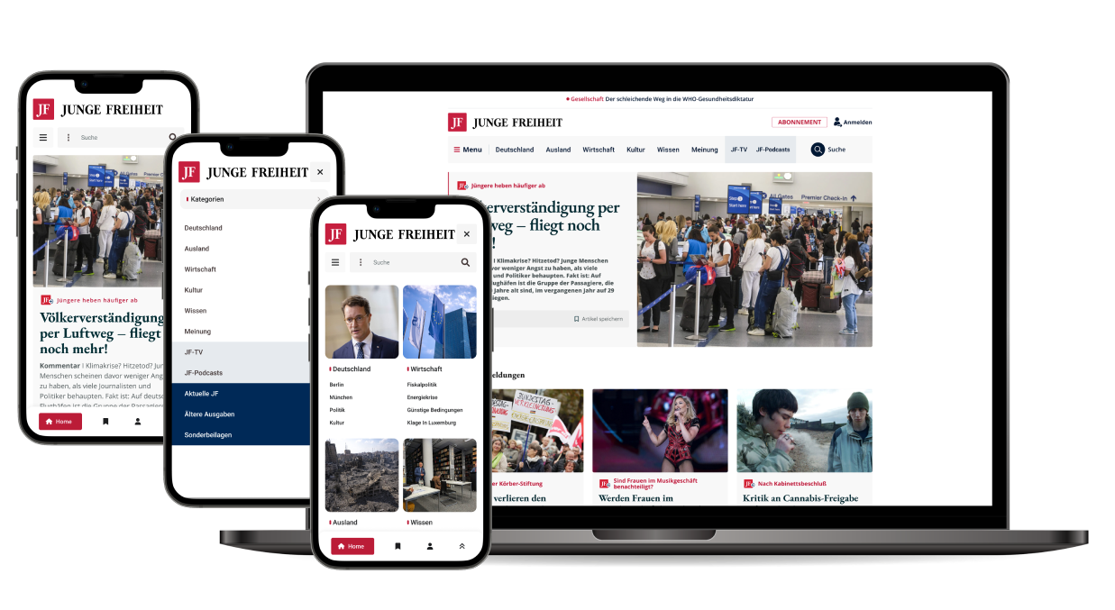
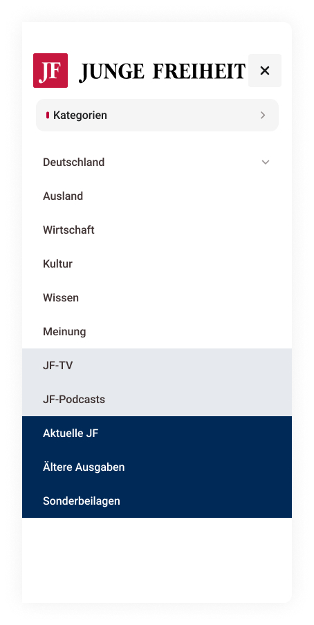
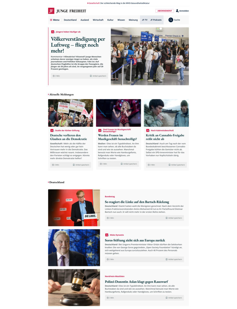
Problem 01. The first thing a reader met was a paid placement sitting above the magazine's own name, with editorial and corporate navigation mixed in one row. In the redesign the top of the page belongs to JF: its own newsticker, the masthead, and a navigation row that is purely editorial — Deutschland, Ausland, Wirtschaft, Kultur, Wissen, Meinung, JF-TV, JF-Podcasts. Corporate and service items moved behind the Menu, and subscription became one clear button instead of shop items scattered through the article grid.
An article card
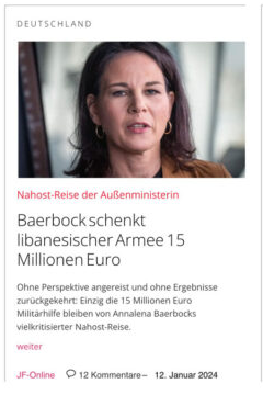

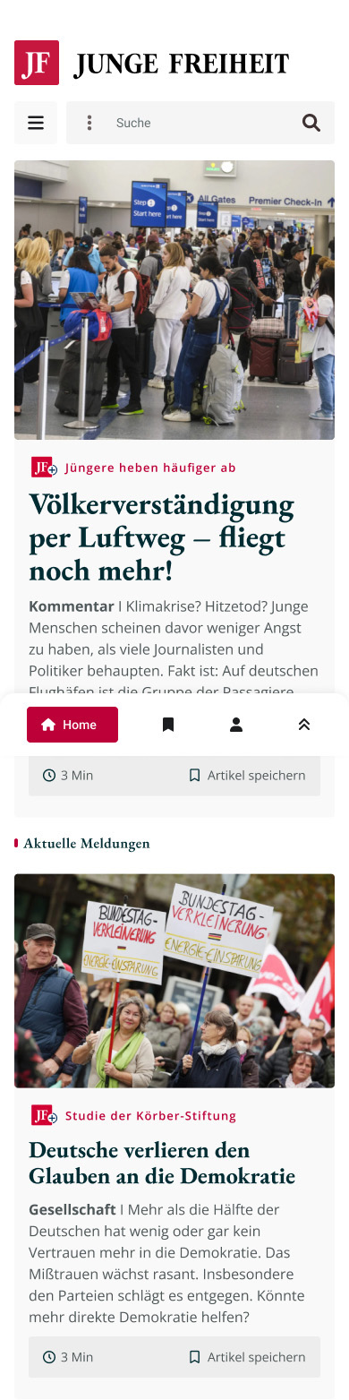
Problems 01–03, in a single component. The category went from grey capitals at almost no contrast to a red kicker carrying the JF badge, with the section named in bold at the head of the standfirst. And the two things readers had asked for arrived on every card: how long the piece takes, and a control to keep it. The card is one module, so the same treatment carries across the homepage, the category pages and the article page. Shown here from the mobile prototype, where it was designed first.
Naming the page's own sections
Problem 02 again, at page level. The old homepage ran cards continuously with no divisions, so readers had to infer what the site held. The redesign breaks it into labelled bands — Aktuelle Meldungen, then Deutschland, and so on — each marked in the publication's red. The homepage now states what it contains instead of leaving that job to the menu.
Mobile-first
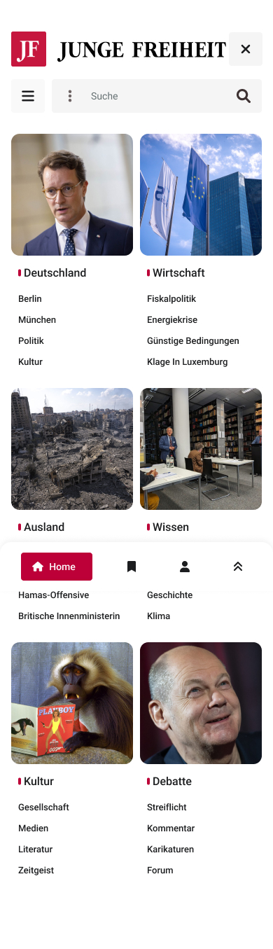
I designed the high-fidelity screens mobile-first, then carried the same modules up to desktop. Two decisions are worth calling out. The menu became a browsable surface rather than a list: each category gets an image tile with its sub-topics beneath it, so opening the menu is itself a way of discovering content. And saving got a permanent home — the bookmark in the bottom bar — so the save control on each card leads somewhere the reader can return to.
The clickable prototype
The mega-menu, homepage and category views were built as clickable, animated prototypes, so every flow could be walked through and signed off before development began.
Desktop & the article page
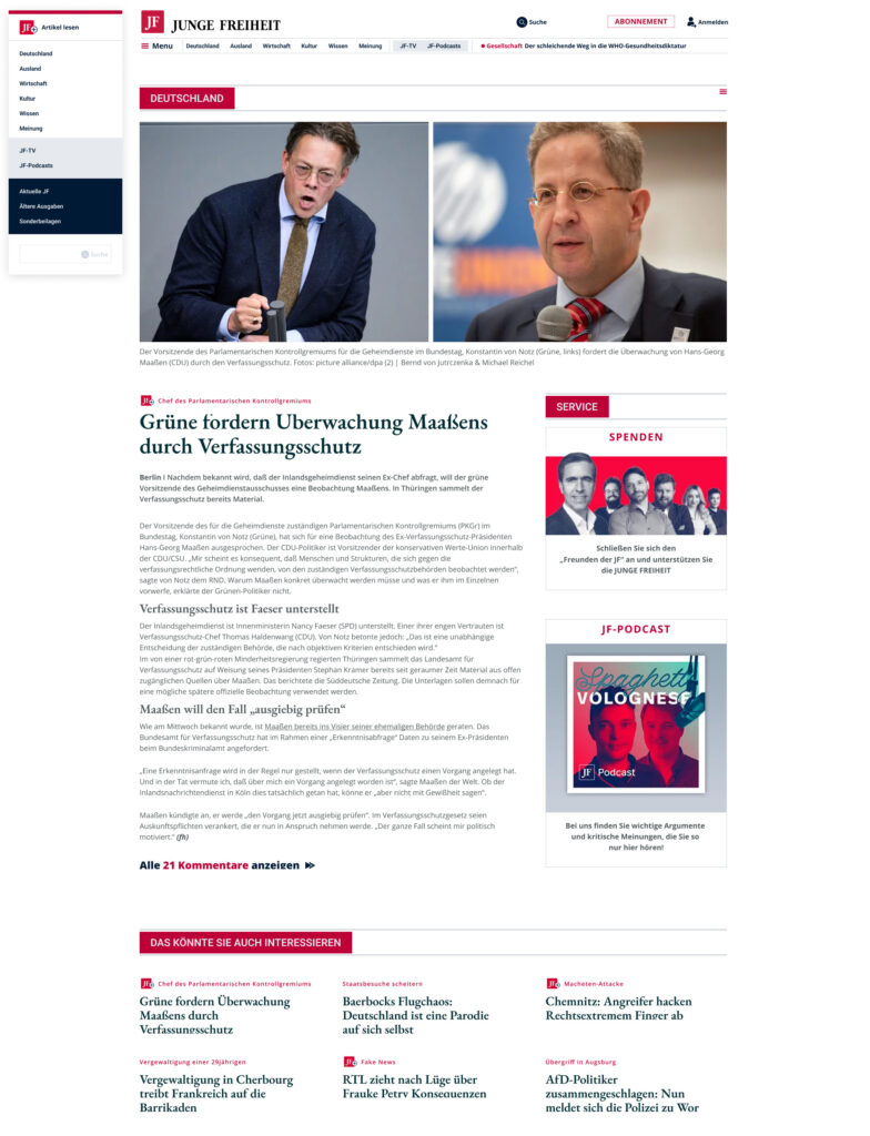
On the article template the three problems get their last answers: the JF badge marks the piece as the publication's own, a category rail stays with the reader down the length of the article, and a related-articles grid closes the page — so the route onward is another article rather than the menu.
05
Extending the design language, not replacing it
A 1986 publication, a long-standing readership and a phased rollout — the system had to absorb all three.
A clean visual break was the wrong call here. The rollout was planned in phases, which meant old and new pages would be live at the same time — so the redesign had to stay recognisably Junge Freiheit throughout. Rather than starting over, I extended the existing design-language system with the modules the redesign called for.
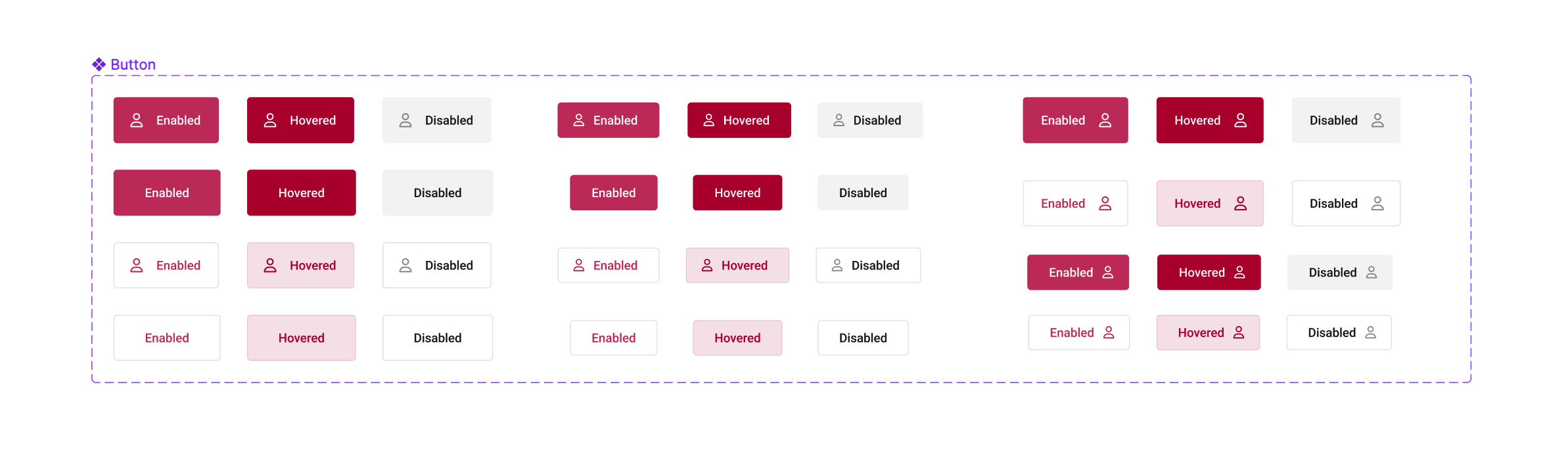
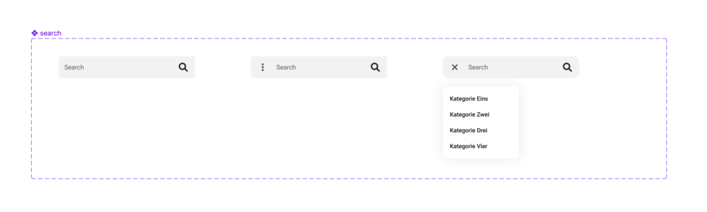
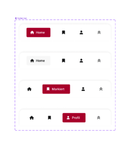
Each was built as a reusable component with its full range of states: buttons across enabled, hovered and disabled for every variant; the search field from its resting state through to an open results dropdown; the footer navigation bar mapped for each active tab. Documenting the states this way is what made a phased rollout buildable — developers had a build-ready reference rather than a set of screenshots to interpret.
06
Outcome
Tested against the live site, and approved — then the rollout went another way.
Tested
A/B tested against the existing site
Won
The redesign won the comparison
Approved
Direction and phased rollout signed off by the owners
Priorities shifted on the publisher's side after sign-off, the project moved out of my hands, and the site running today took a different direction. The rollout was a business decision, not a design one — what the work established still stands: it was researched with readers, built as a system, tested against the incumbent and approved on its merits.
The brief arrived as a conversion problem and the research turned it into a trust problem. Had I treated it as the visual refresh it was described as, the ad above the masthead and the shop items inside the article grid would have survived the redesign — and so would the reason readers distrusted the page.
More work
View all SparkifyRebuilding a field-documentation app from scratch — and the design system behind it
 House of Mobile & GamesRedesigning an e-commerce homepage and lifting conversions by 46%
 Second OpinionGetting a patient to trust a doctor they have never met
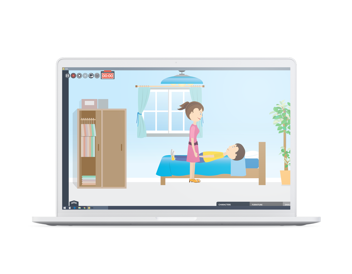 Social Skills AnimationTurning social stories into animations a therapist can build inside a session
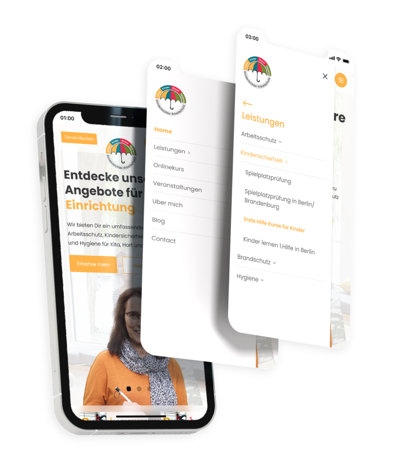 Kinderleichter ArbeitsschutzGiving a safety-services business its first digital product