WorkSecond Opinion
Getting a patient to trust a doctor they have never met
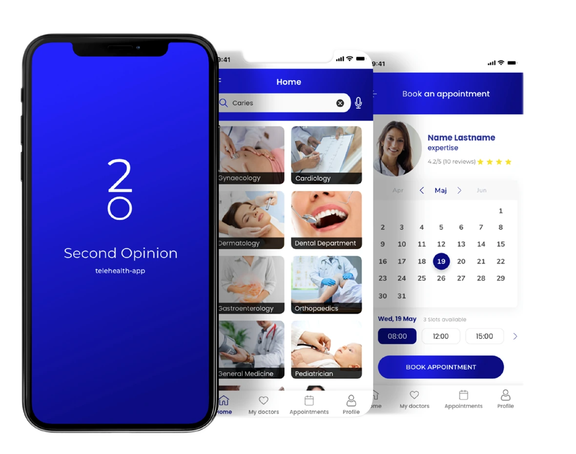
Second Opinion connects patients to a certified doctor by video in minutes. Minutes was the easy part. The harder question was how someone decides, quickly, that a stranger on a screen is the right person to tell about their health — and that is what the design had to answer. As the sole designer on the project, I owned it end to end — research through to a product that shipped in the United States with a roster of certified doctors — and led the team that built it — engineering and product.
My role
- UX research
- Competitor analysis
- User flows & IA
- Low / mid / high-fidelity prototypes
- Usability testing
- High-fidelity UI
The team
- Stakeholders
- Frontend & Backend Developers
- Product Management
Deliverables
- Competitor analysis
- Surveys & interviews
- Journey & task flows
- Site map
- Wireframes & prototypes
- Usability tests
- High-fidelity UI
01
A confidence problem, not a search problem
The brief was speed. The research kept returning to trust.
The goal
Enable anyone, anywhere, to connect in a few minutes to a certified specialist through a video call.
Speed is a routing problem and it is solvable. The part that decides whether a telehealth product gets used is quieter: handing your symptoms to someone you have never met, chosen from a list, in a few minutes. Interviews and later testing both circled the same thing — people were not asking to go faster. They were asking for enough to feel sure.
What the competitors taught me
I profiled two market leaders — Doctor On Demand and Amwell — across positioning, onboarding and a UX-competitive analysis. Both sell care without insurance, so the differentiator was not the offer. Amwell earned its first impression with a polished sign-up and Face ID entry; Doctor On Demand lost ground at exactly that point, with clumsy onboarding and phone-number handling. That set the priority: the first two minutes carry the credibility, so onboarding and sign-up got designed first rather than last.


02
What patients needed
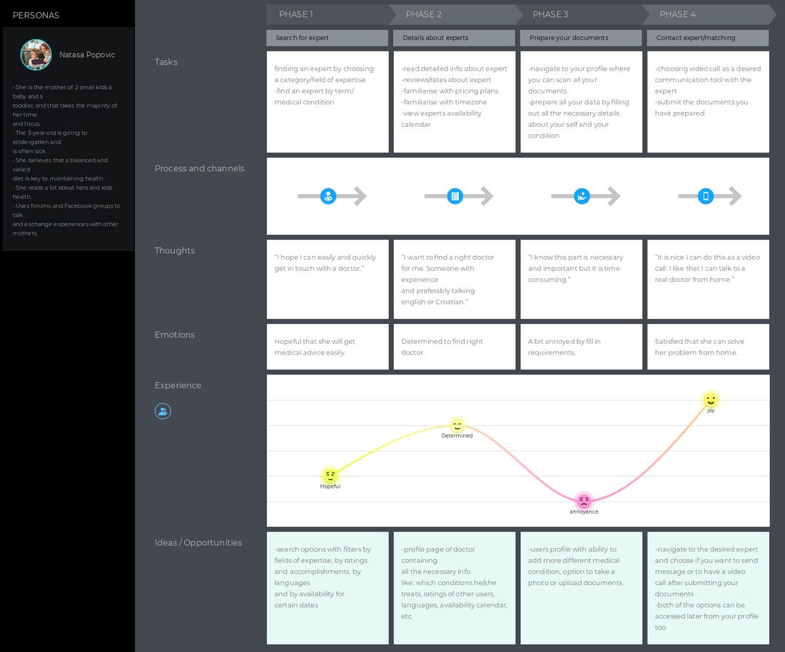
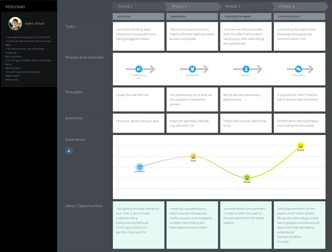
Surveys, interviews, personas and journey maps — reduced to the four things that shaped the product.
Is this person any good?
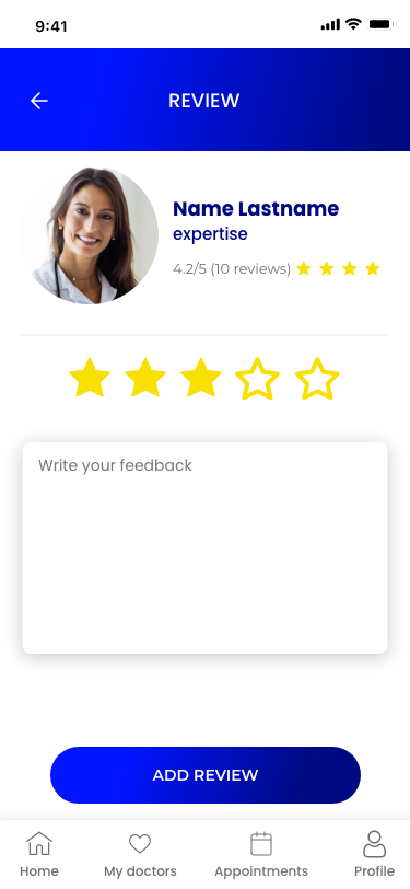
Choosing a doctor you have never met is a confidence decision, not a search result. Expertise, ratings and reviews had to be visible before booking.
I cannot easily get to a doctor.
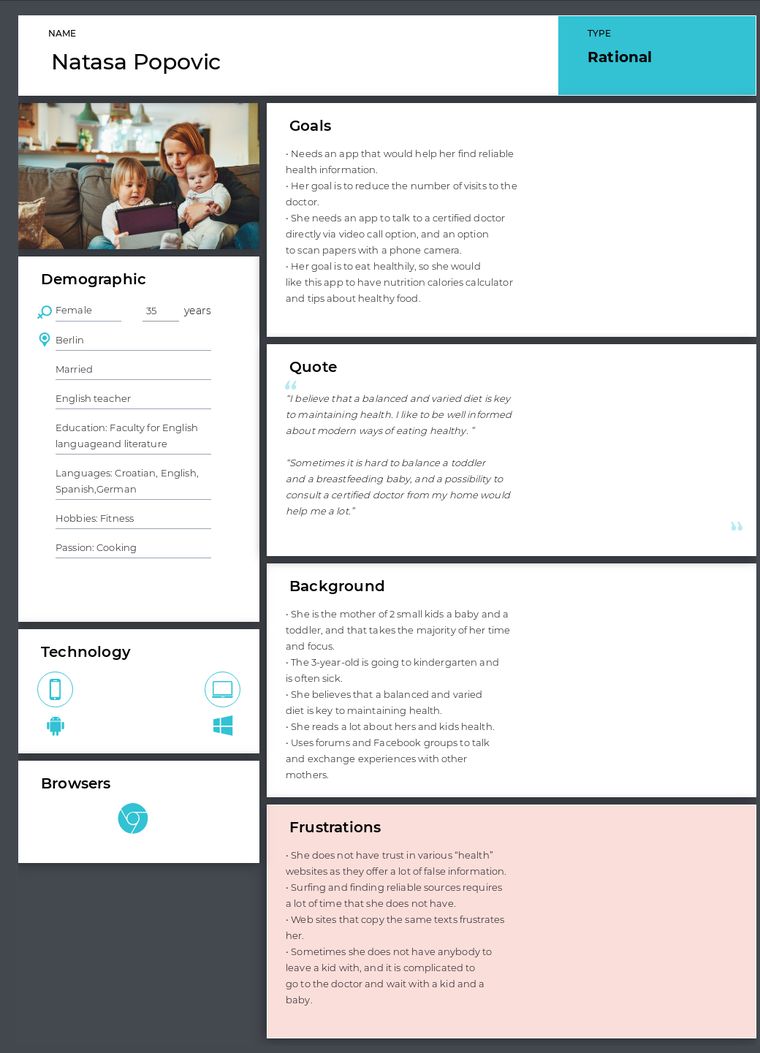
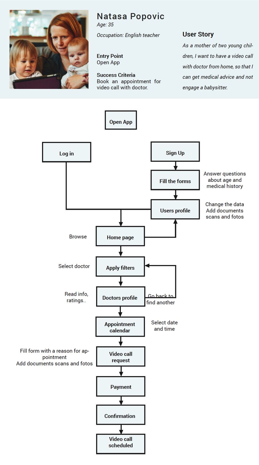
One persona was at home with a toddler and a baby — the barrier was not finding care, it was leaving the house to reach it.
I might forget something important.
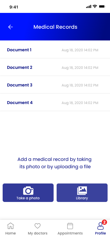
Patients wanted to set out the reason for the consultation, and attach documents or photos, before the call started.
I want to go back to someone I trusted.
A doctor who helped once should be one tap away the next time, without searching for them again.
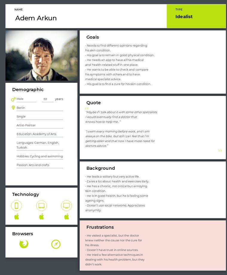
The second one reframed the product for me. One persona was a mother of two young children who did not trust health websites and could not simply leave the house to see a doctor. That is a different product than a faster search.
03
Choosing with confidence
Moving someone from "I need help" to "this is the doctor I want to speak to".
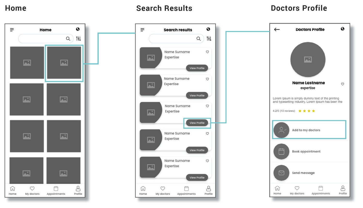
The home screen opens on specialties rather than a search field, because most people know the kind of problem they have before they know who treats it. From there the doctor profile carries the things that actually decide it: field of expertise, ratings, written reviews from other patients, and when they are next free. Availability sits next to credibility on purpose — a brilliant doctor with no slot this week does not solve the problem someone opened the app with.
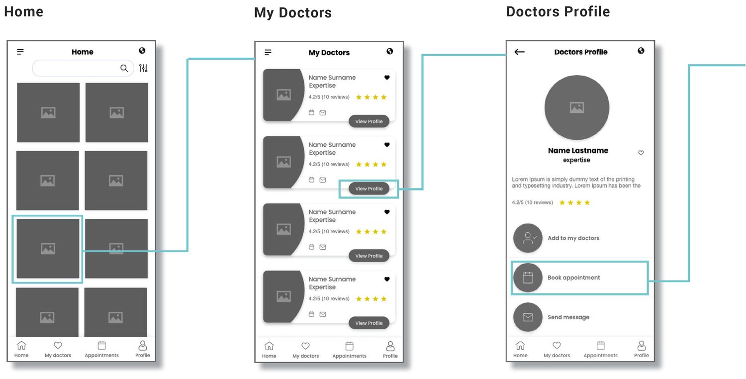
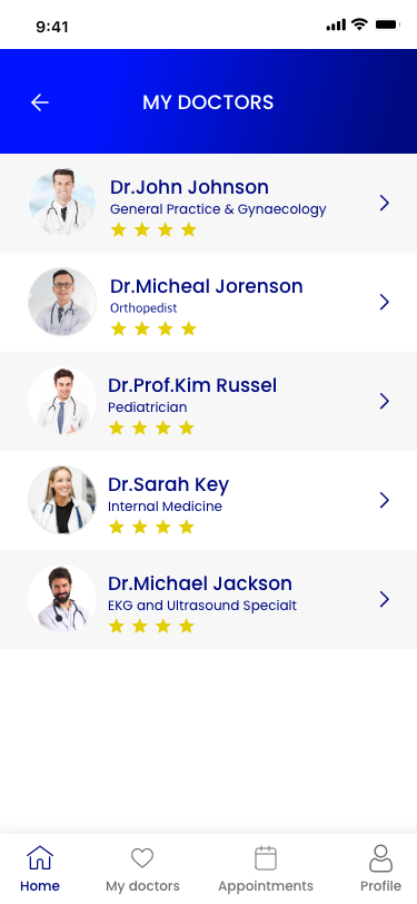
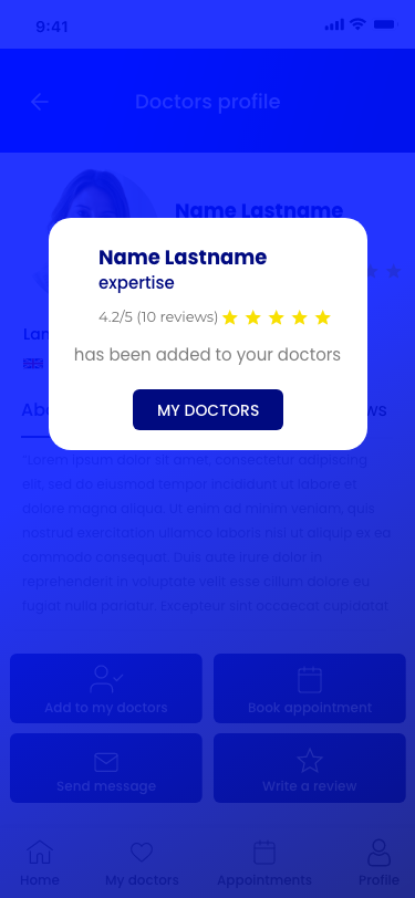
And once someone has found a doctor who helped, they should not have to find them again. Saving a doctor to My Doctors makes the second consultation a shortcut instead of a fresh decision — which is also the fastest route the product has.
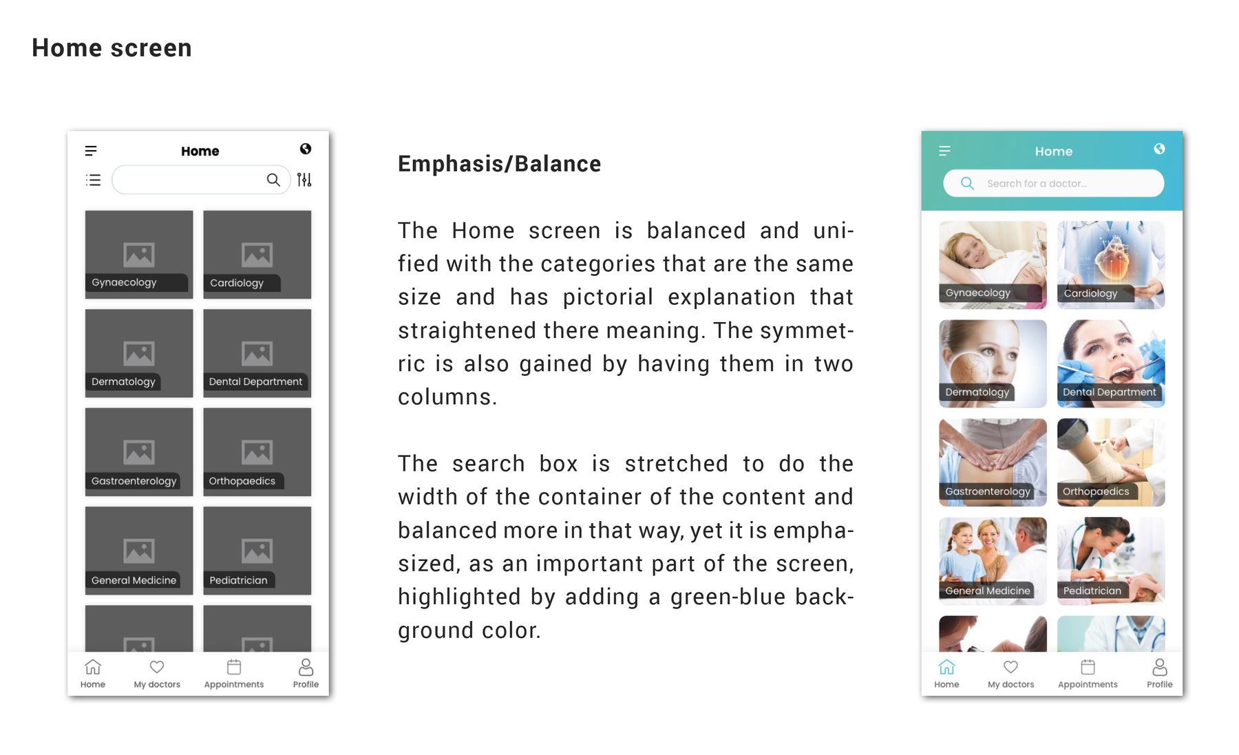
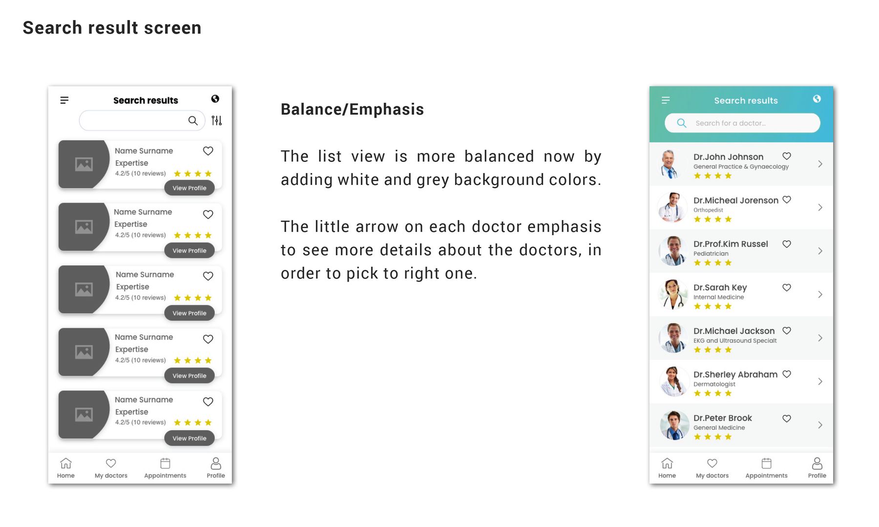
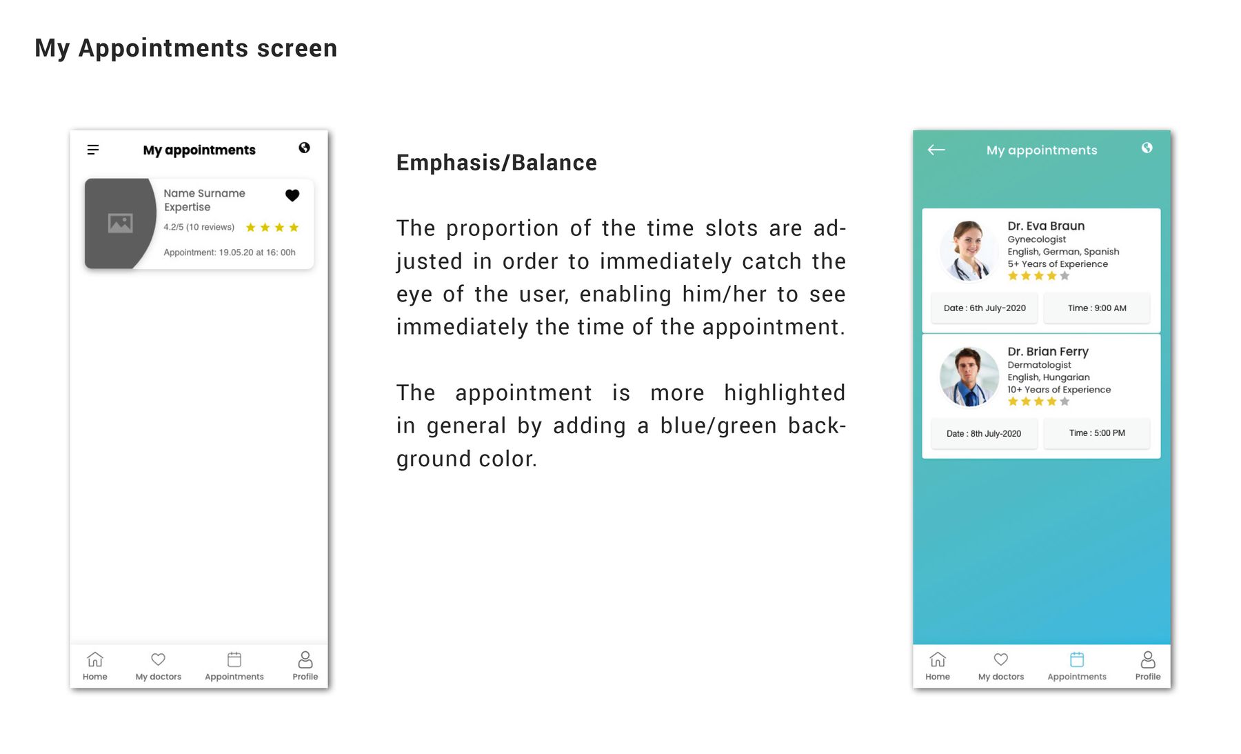
Each screen went from wireframe to interface with the same structure — the visual pass tightened hierarchy rather than rearranging it.
04
Two ways to get help
Not every health question needs a video call — so the product offers two routes at different levels of urgency.
Route 1
Video consultation
- Find a specialty
- Compare doctors
- Pick a time
- Explain the concern
- Pay
- Join the call
Route 2
Message a doctor
- Find a specialty
- Read the profile
- Write the question
- Attach documents
- Pay
- Send
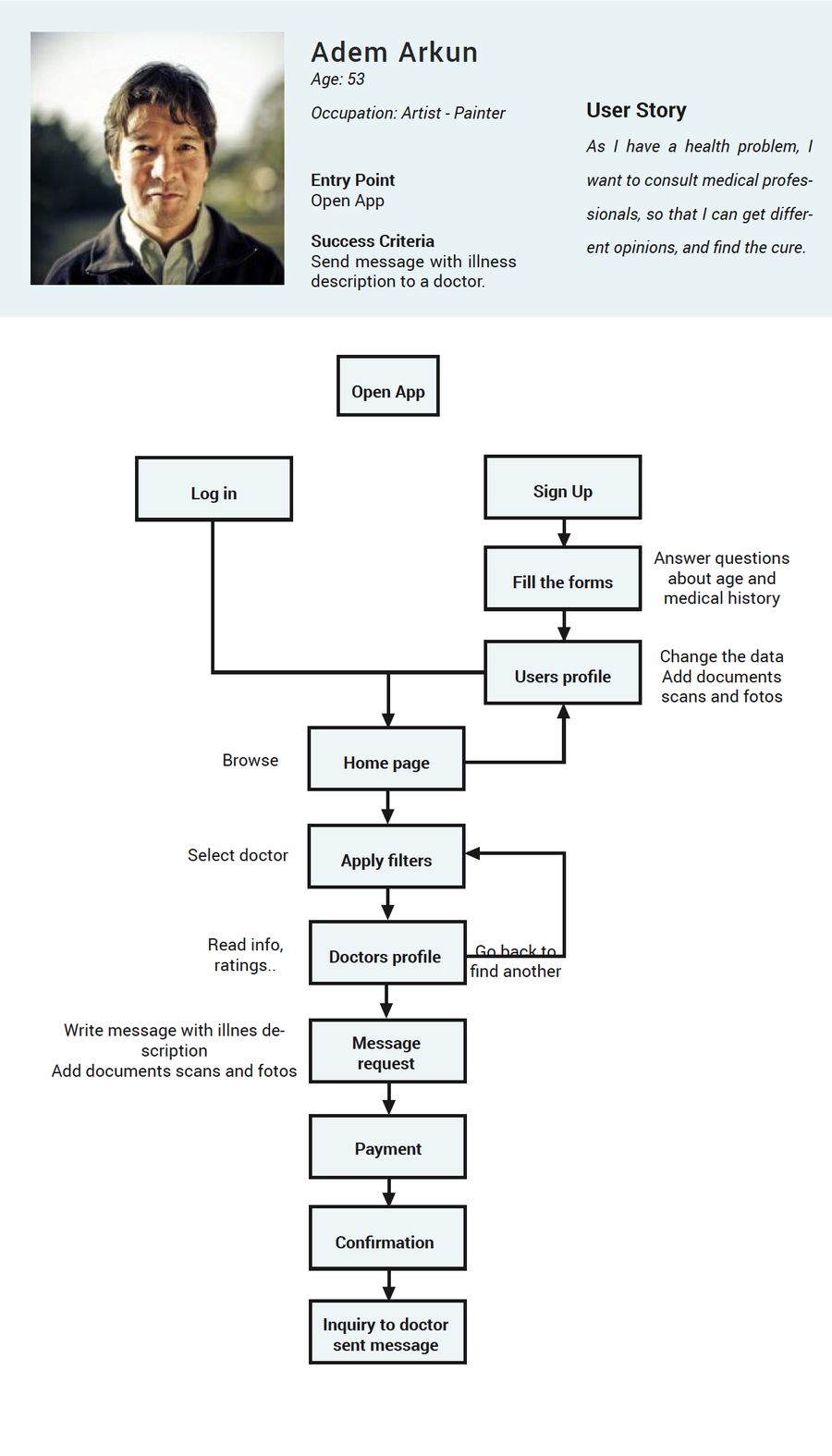
Both routes share the same opening — find the specialty, judge the doctor — and then split by how urgent the question is. Messaging carries the attachment step, because a photo of a rash or a set of test results is often the whole question. It also answers what patients said they feared most: forgetting something important once the conversation starts.
05
From choice to consultation
Six steps from a specialty to a booked call — and the structure that keeps it to six.
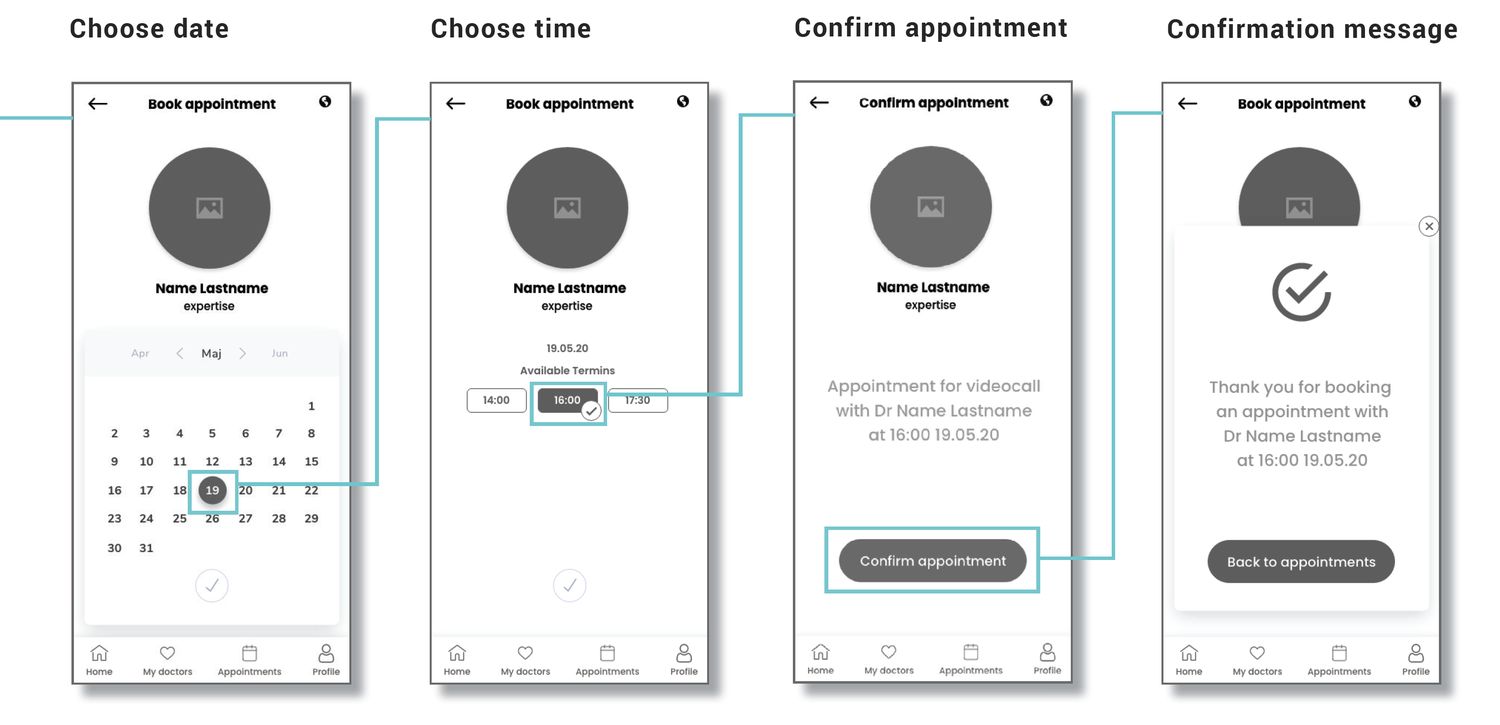
The architecture splits the app into three streams: getting in, managing an account, and the part that matters — finding a doctor and scheduling with them. Only the third one sits on the booking path, and everything on that path had to earn its place, because each extra step is a chance to reconsider. What is left is six:
- Specialty
- Search results
- Doctor profile
- Pick a time
- Pay
- Confirmation
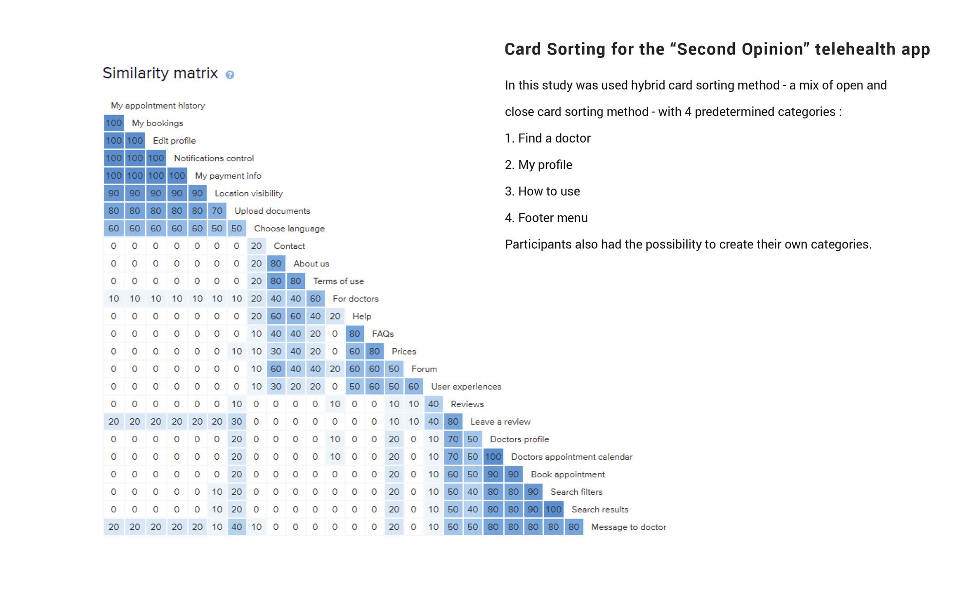
Testing the structure before the pixels
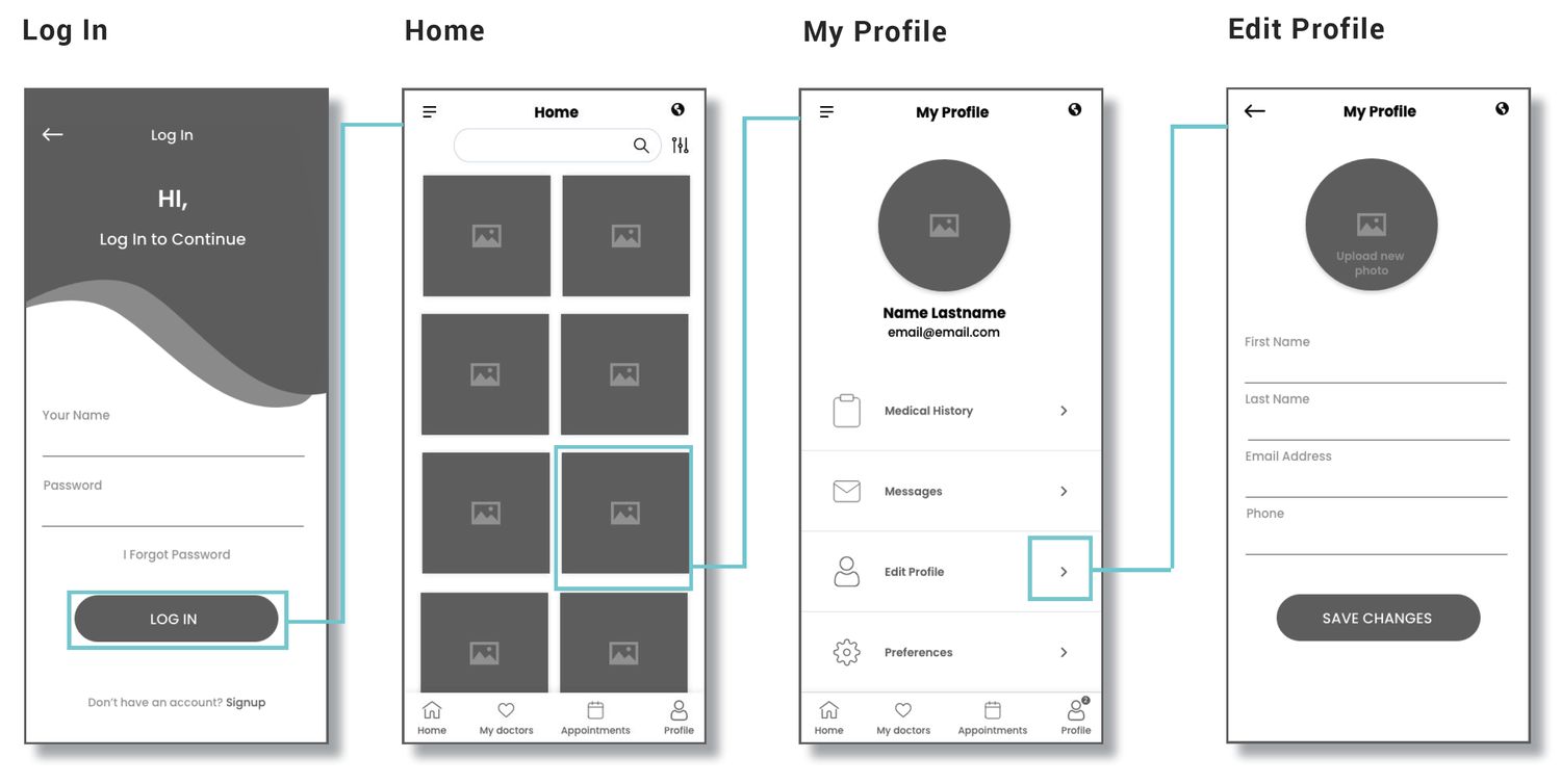
Low-fidelity testing showed how people expected to move through the flow — watching where they tapped and swiped, and what they expected next, settled the structure before any of it was styled. Swipe through the mid-fidelity flow:
06
What testing changed
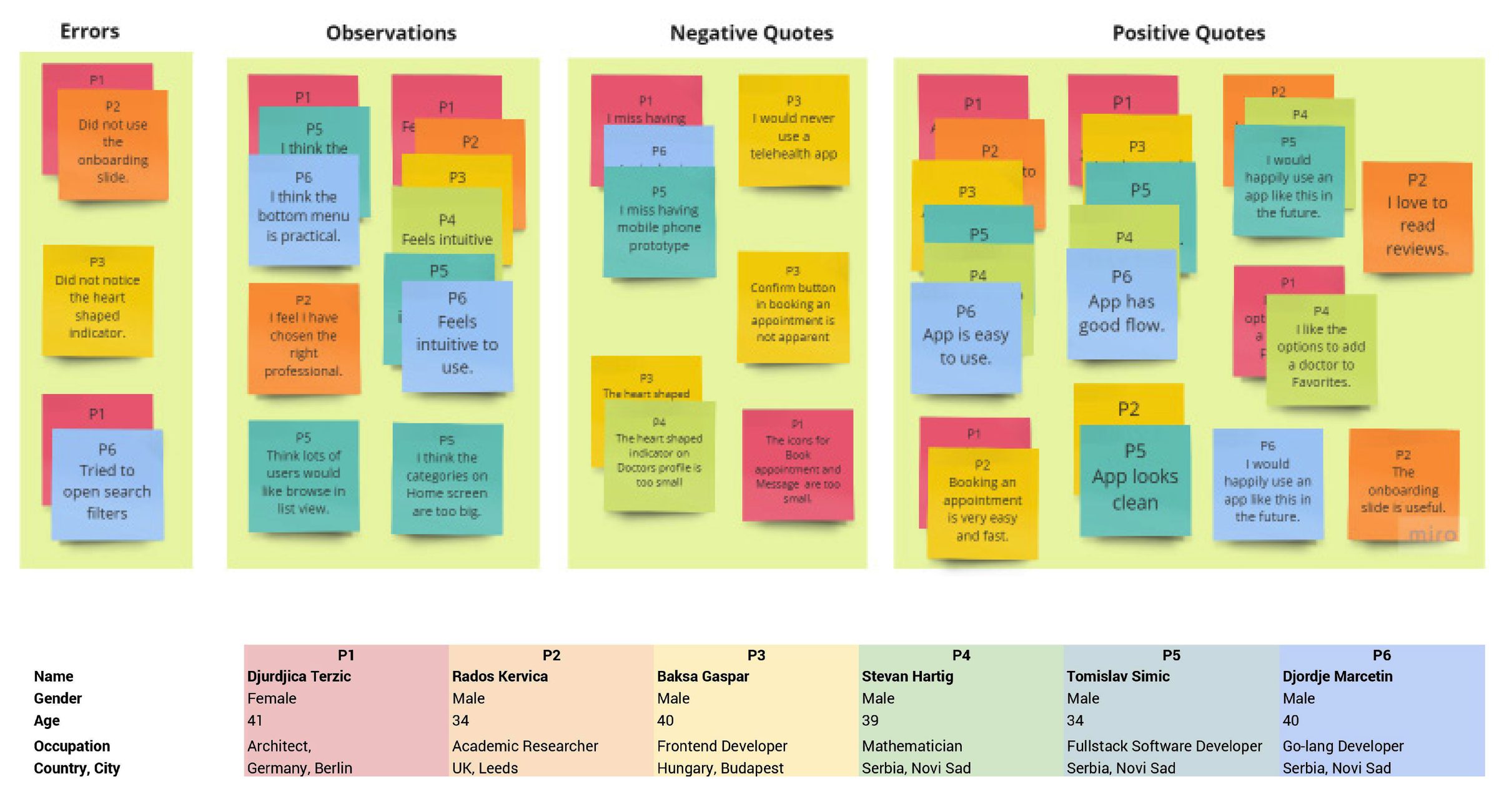
Six participants across four countries, moderated and remote. Three issues were worth acting on.
Participants were in Berlin, Leeds, Budapest and Novi Sad, aged 34 to 41, and I rated issues on Nielsen's severity scale. Four of the six work in software, which made the sample good at surfacing usability problems, but not representative of how a less confident user would cope.
Reached for search filters that did not exist
Participants tried to narrow the doctor list before I had built a way to do it. Filtering moved from a nice-to-have into the search results screen.
Missed the favourite indicator on a doctor profile
The heart was too small to register. It was enlarged and given a state change, so adding a doctor to My Doctors confirms itself.
Skipped the onboarding entirely
The prototype could not be swiped on a phone, so onboarding read as a dead screen. It was rebuilt to be tested on a real device.
The filter finding was the most useful of the three. Half the participants had already decided the doctor list was something you narrow down rather than scroll — a structural expectation about the product, and one that only surfaced from watching people use it rather than asking them about it.
- The confirm button when booking was not obvious enough — made more prominent
- Book and Message icons in My Doctors were too small to hit confidently
- Home-screen category tiles were larger than they needed to be
- Added a list view for browsing, and reminders for upcoming appointments
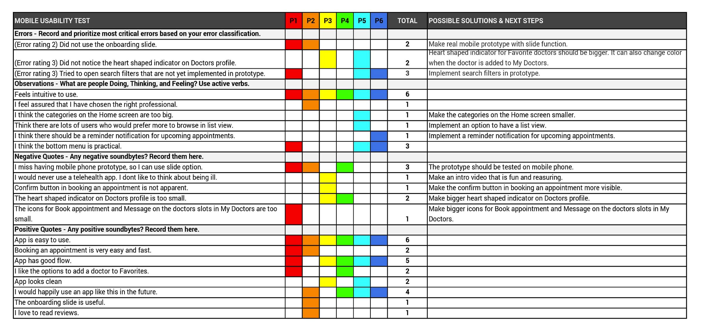
What held up
“App is easy to use.”
6 of 6
“Feels intuitive to use.”
6 of 6
“App has good flow.”
5 of 6
“I would happily use an app like this in the future.”
4 of 6
One participant answered the trust question directly: “I feel assured that I have chosen the right professional.” Another was a useful reminder of the product’s limit — “I would never use a telehealth app. I don’t like to think about being ill.” Some hesitation is not an interface problem, and it is worth knowing which part you cannot design away.
07
The product
The core path, and the full flow behind it.
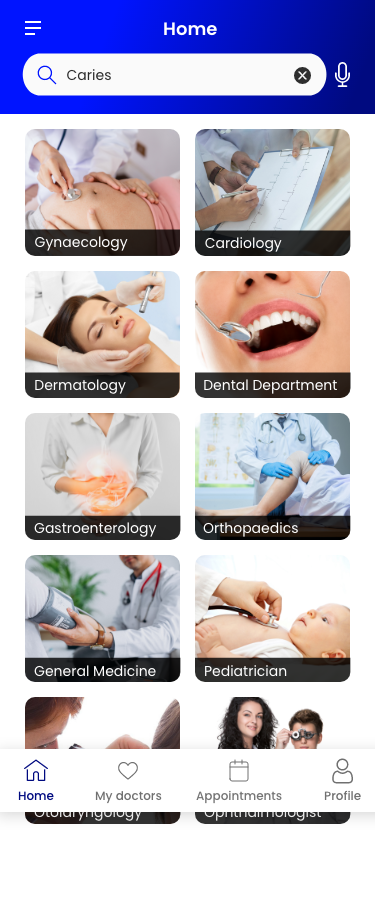
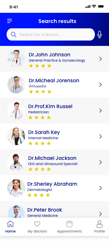
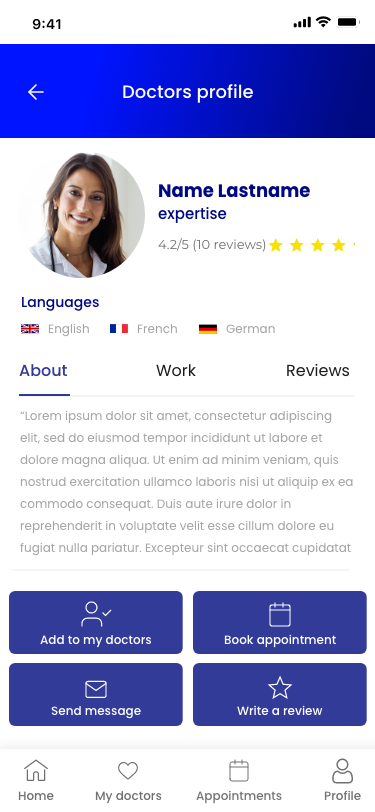
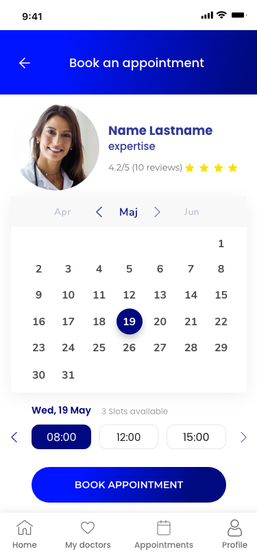
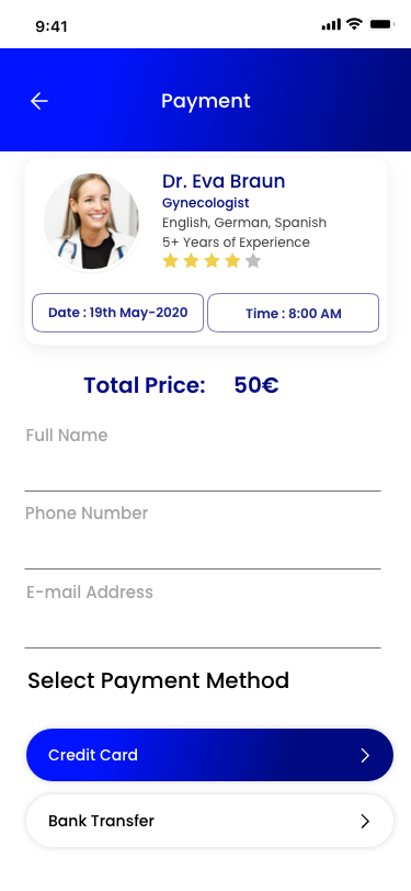
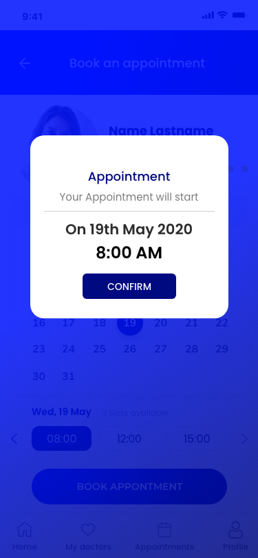
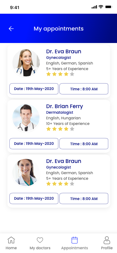
The full flow
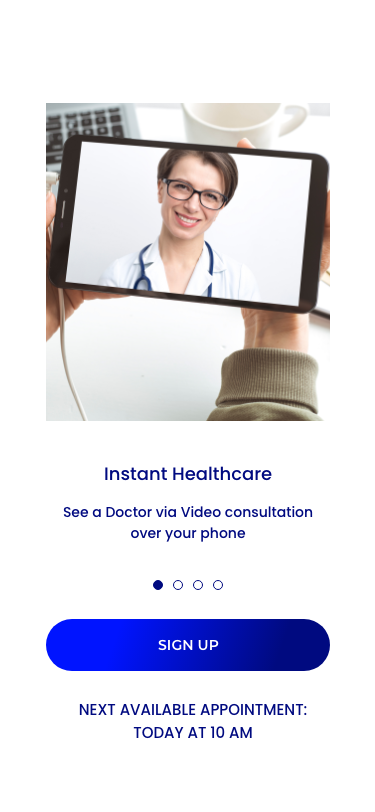
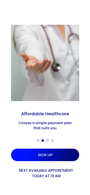
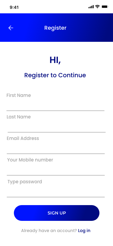
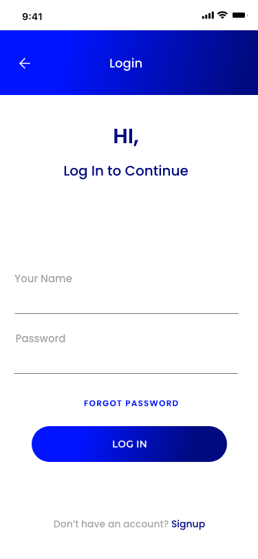
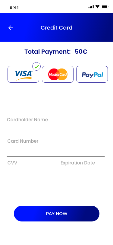
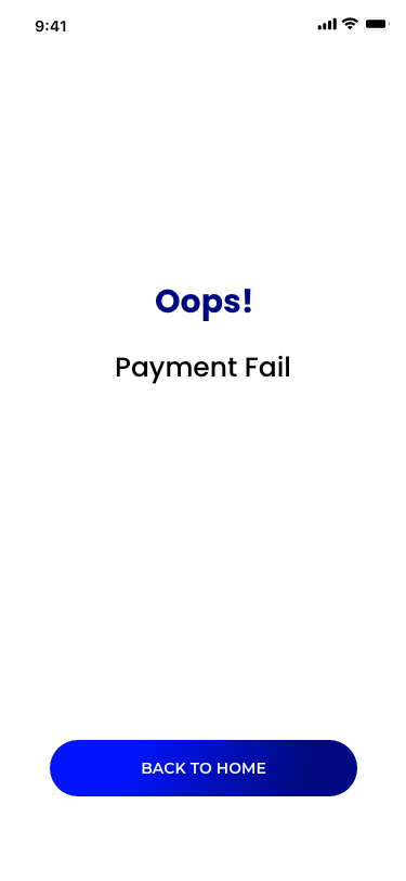
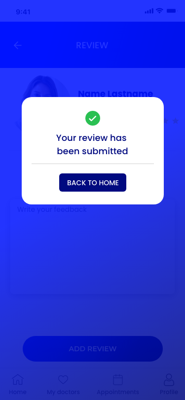
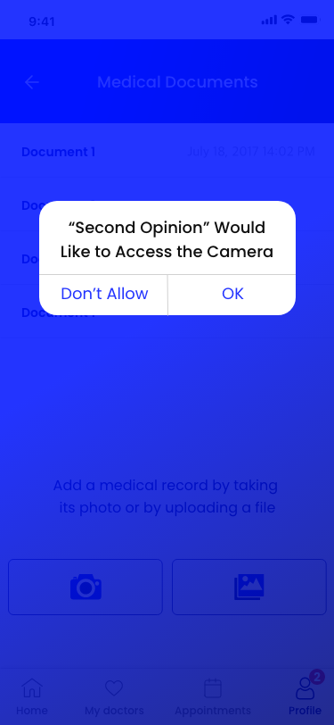
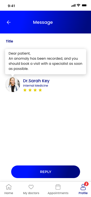
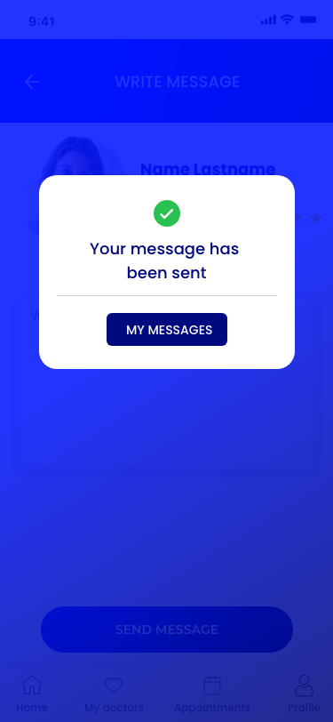
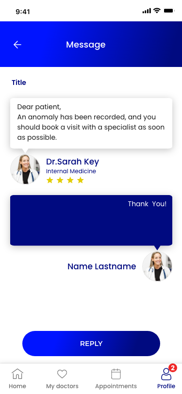
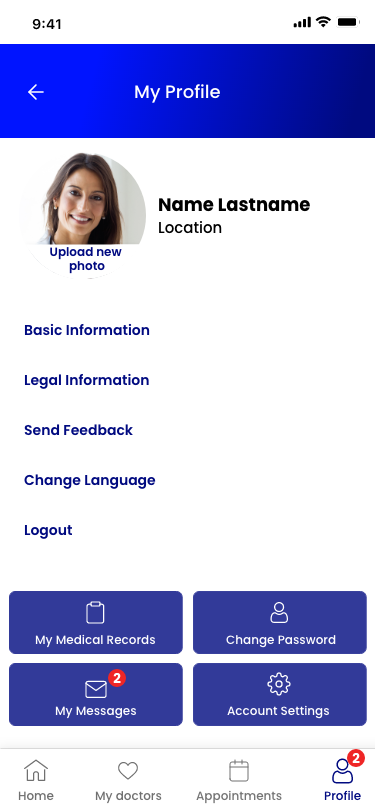
Onboarding and sign-up, search and profiles, booking and payment, documents and messaging, reviews, appointments and profile — including the error and confirmation states. Swipe through, or tap any screen to enlarge:
08
Outcome
Launched in the United States, putting a certified doctor within reach of patients who could not easily get to one.
Shipped
Launched in the United States
Video consultations and messaging, for US patients
12+
Certified doctors on the platform
On the roster at launch
6 of 6
Found it easy and intuitive to use
Moderated usability test, six participants, before launch
Zero to one
Research through to the shipped product
Sole designer, led delivery
The product went live in the US with 12+ certified doctors on the roster, and did the thing it was designed for: reaching people who needed a consultation but could not easily get to a doctor's office.
The brief had been speed — connect anyone to a certified specialist in a few minutes. The product delivers that, but the research had shown speed was never the hard part. What shipped answers the harder question: expertise, ratings and reviews sit on the profile before anything is booked, so choosing is a judgement rather than a guess.
More work
View all SparkifyRebuilding a field-documentation app from scratch — and the design system behind it
 House of Mobile & GamesRedesigning an e-commerce homepage and lifting conversions by 46%
 Social Skills AnimationTurning social stories into animations a therapist can build inside a session
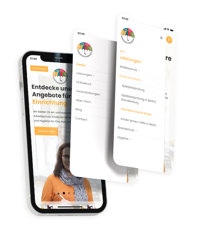 Kinderleichter ArbeitsschutzGiving a safety-services business its first digital product
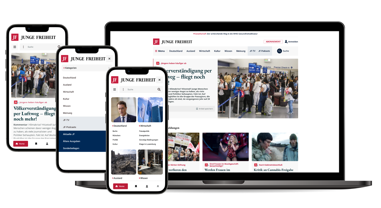 Junge FreiheitMaking a decades-old publication legible again online