WorkHouse of Mobile & Games
Redesigning an e-commerce homepage and lifting conversions by 46%
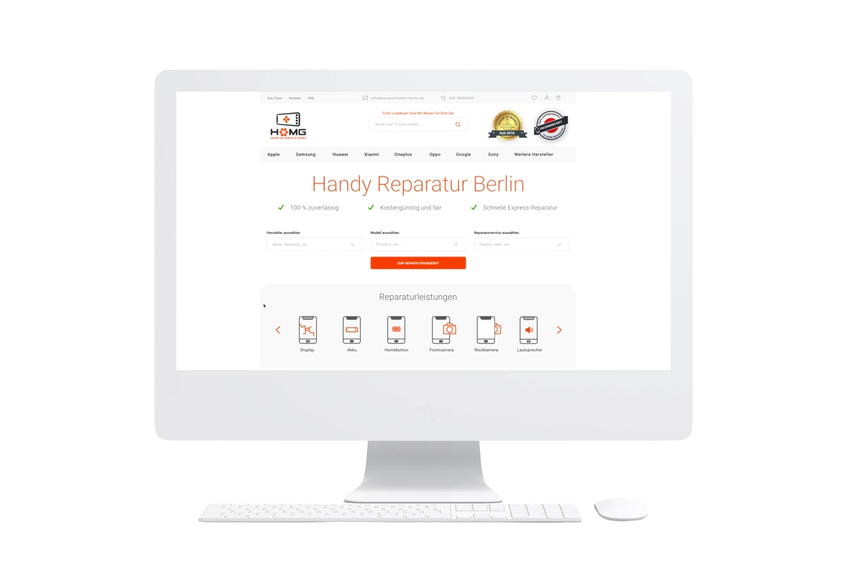
House of Mobile & Games is a Berlin phone- and device-repair business. As Product and UX/UI Designer, I owned it end to end — research through to shipped UI — redesigning their e-commerce experience starting with its most important page, the homepage, then carrying the new design language into the category and product pages.
My role
- UX research
- Competitor analysis
- User-flow improvements
- Mid-fidelity prototypes
- High-fidelity clickable prototypes
- A/B testing
The team
- CEO & Management
- Frontend & Backend Developers
- Product Management
Deliverables
- User-flow optimisation
- Mock-ups
- Prototypes
- Custom icon set
- Design-language update
- Test results
01
The problem
The homepage introduced the shop. The customer arrived with a broken phone.
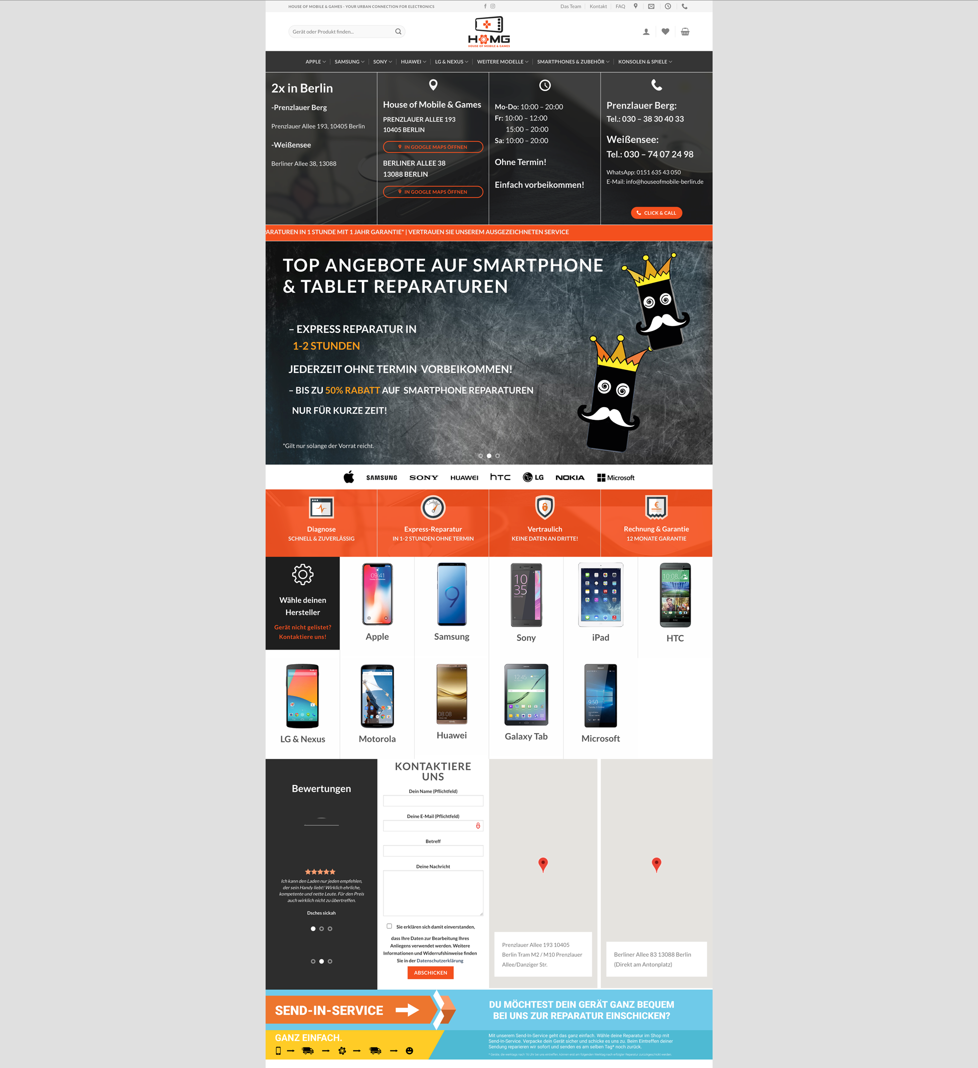
The homepage carries the whole storefront. Almost everyone landing on it wants one thing: to find out what it costs to fix a specific device. The old page answered a different question first.
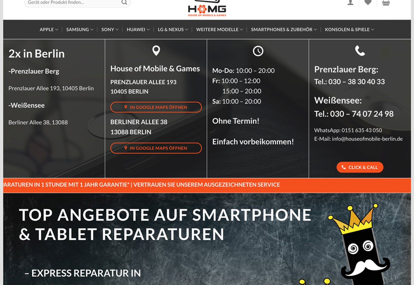
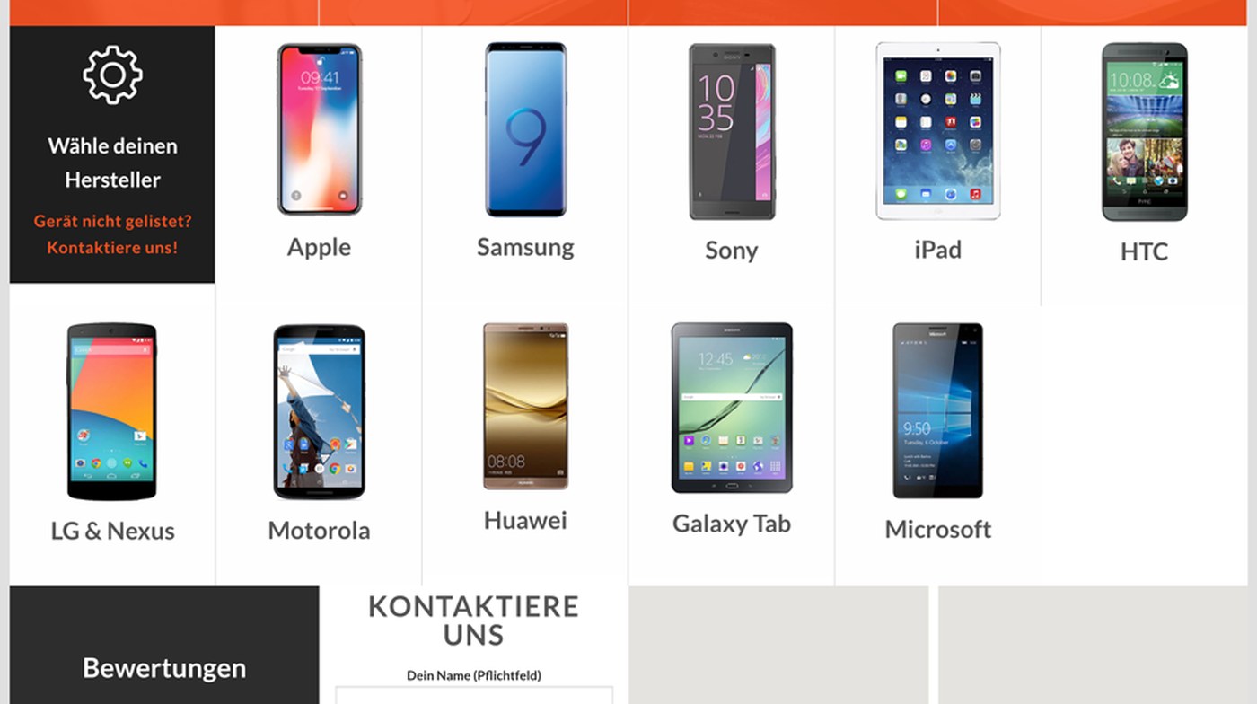
The insight: nobody visits a repair shop's website to browse. They arrive with a broken device and one question — can you fix this, and what does it cost? The homepage's job was to answer that above the fold, and let everything else follow.
02
The redesign
Put the repair journey first, and make every service reachable without digging.
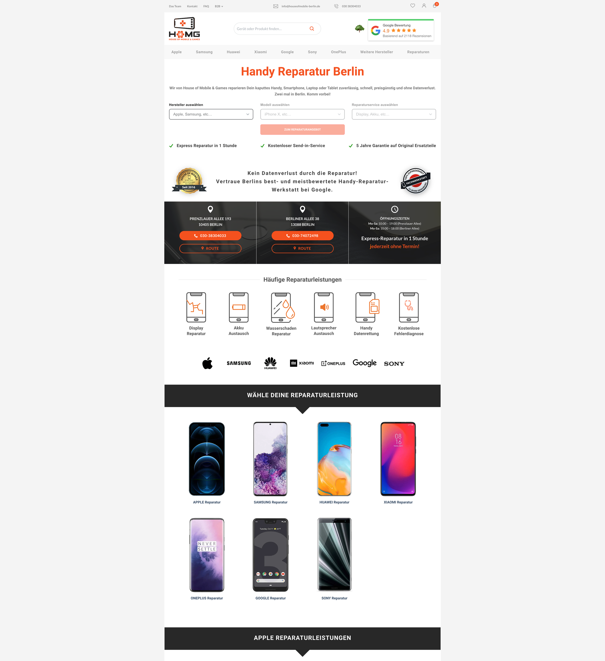
I rebuilt the page around a three-step filter — manufacturer → model → repair service — sitting directly under the headline, ending in a price. It turns a browse into a form the customer can finish in three clicks. The shop's addresses and opening hours didn't disappear; they moved below it, where they answer the second question rather than the first.
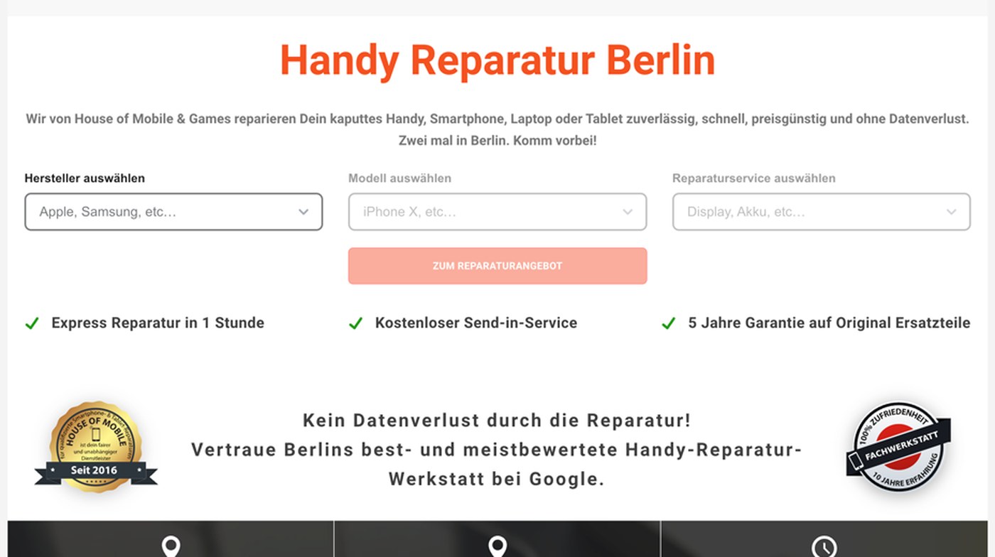
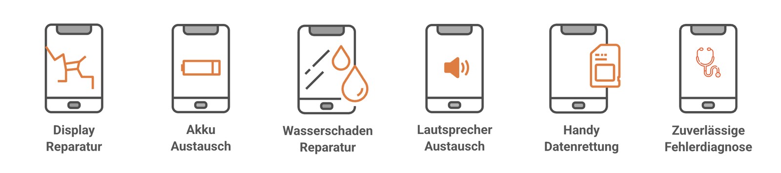
Three moves did the work. The filter-first layout, so a repair starts with the device instead of a scroll; a mega-menu that surfaces every manufacturer and service in one opening, so nothing needs a second guess; and a custom icon set I designed for the services and guarantees, replacing the old photo grid.
I prototyped the interactions in Adobe XD before development. Each one answered a specific question rather than just demonstrating screens:
- Mega-menu — could it expose every manufacturer and service without a second click?
- Homepage filter — did it still feel fast once the model list ran long?
- Mobile navigation — how should the three steps collapse into a stack on a phone?
The fourth recording sets the two surfaces side by side — the same journey, sized for a desk and for one hand.
03
Outcome
A/B tested against the previous homepage — the filter-first version won on overall conversion.
+46%
Conversion-rate uplift
Validated against the previous homepage, not estimated
The redesigned homepage was A/B tested against the previous experience. The filter-first version increased overall conversion by 46%, validating the decision to bring the repair journey directly to the start of the experience.
Session recordings supported the quantitative result, showing visitors engaging with the filter immediately after arriving on the redesigned homepage.
The mega-menu showed the same pattern: service pages that had previously taken several steps to reach were opened directly from the navigation.
Project extended
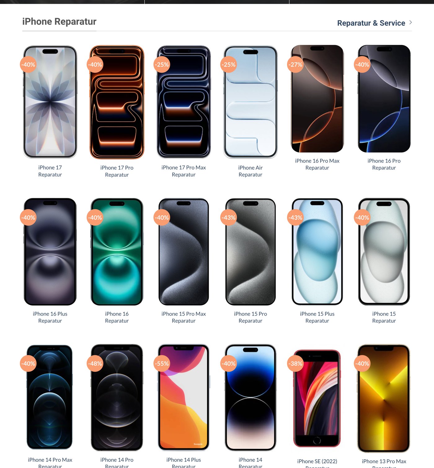
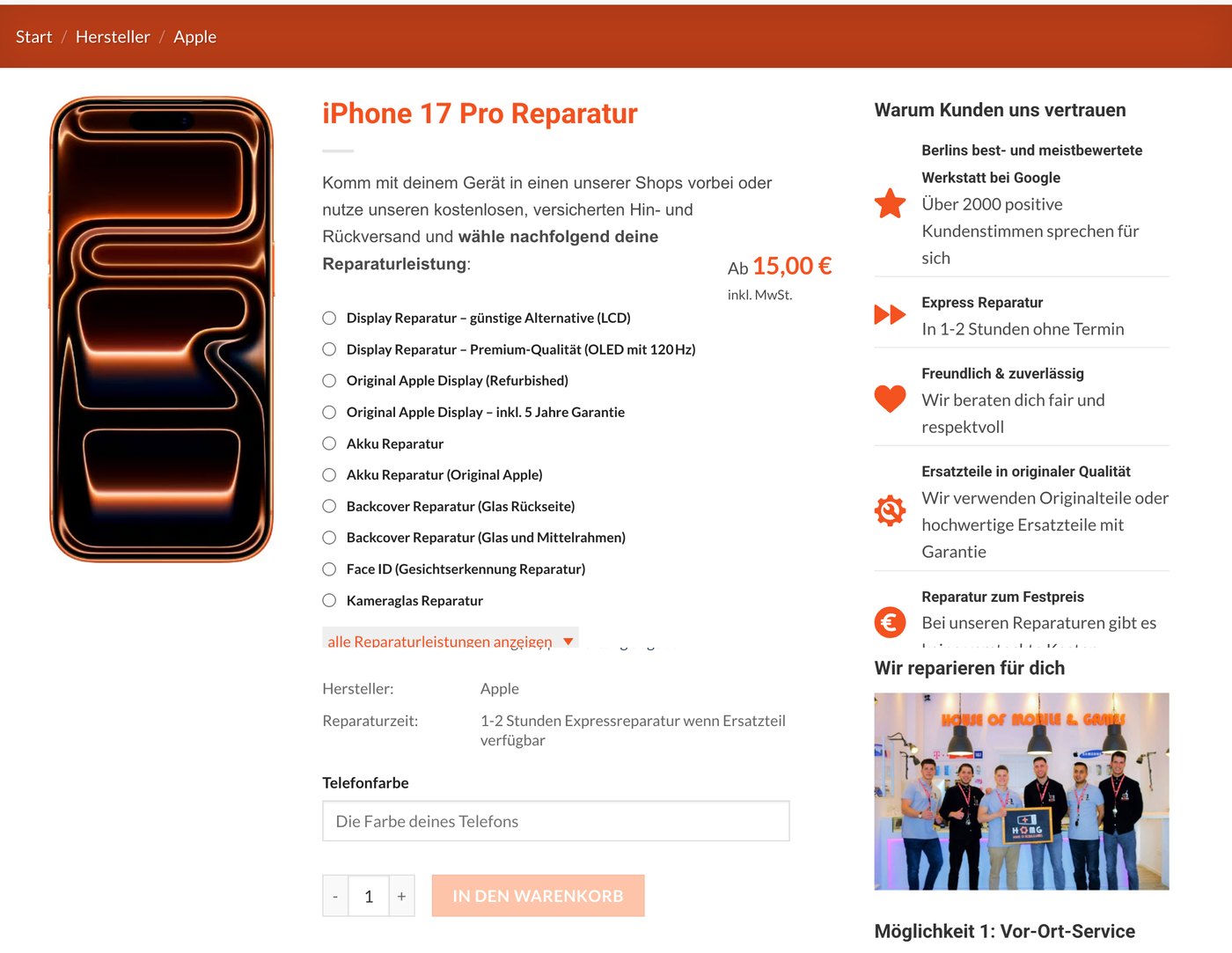
On the strength of the test, the client extended the redesign across the category and product pages — where I carried the same logic further, making the repair service and its price selectable on the product page itself.
More work
View all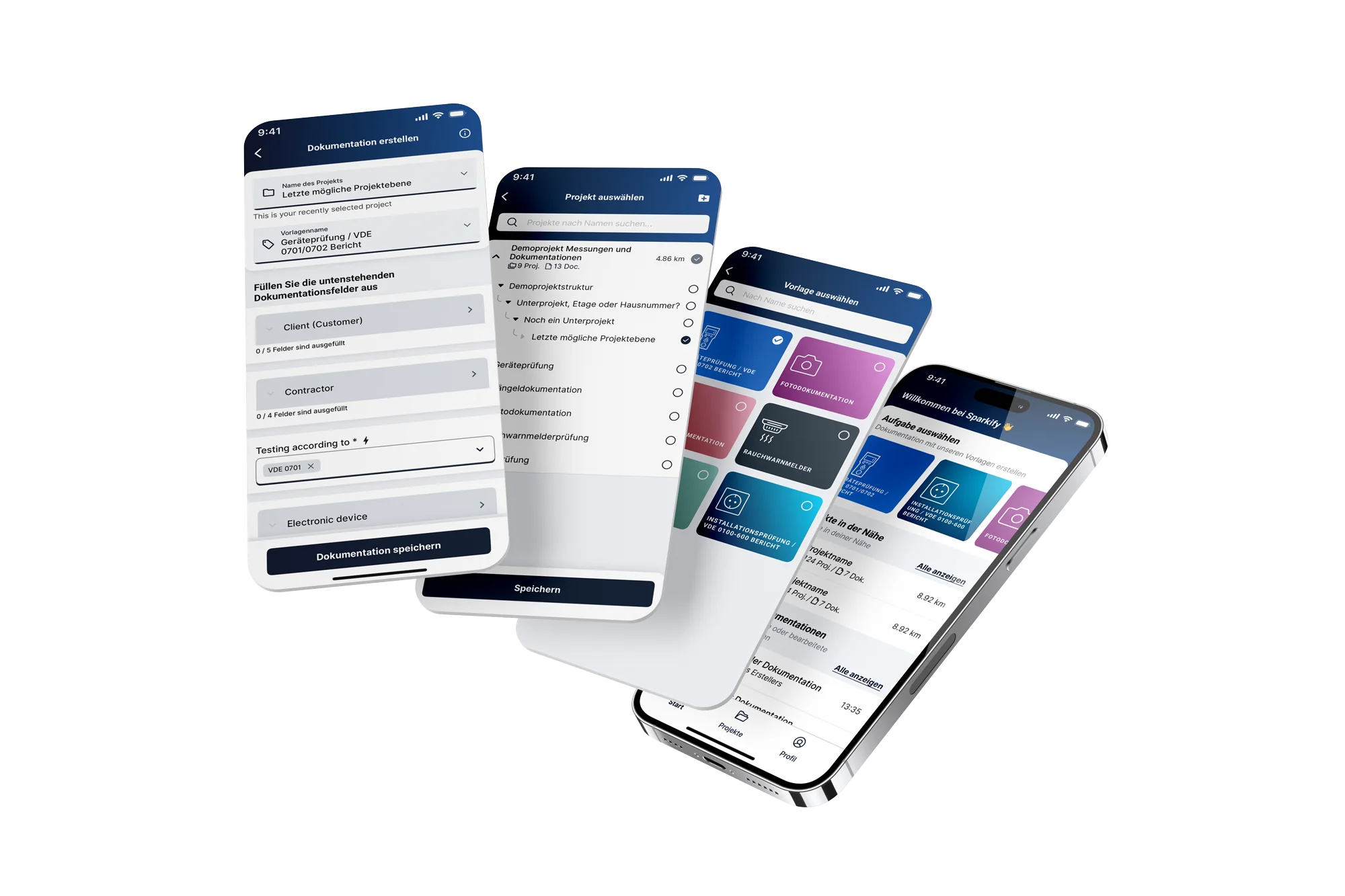 SparkifyRebuilding a field-documentation app from scratch — and the design system behind it
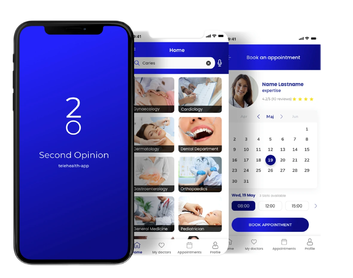 Second OpinionGetting a patient to trust a doctor they have never met
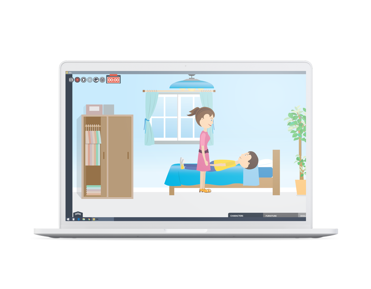 Social Skills AnimationTurning social stories into animations a therapist can build inside a session
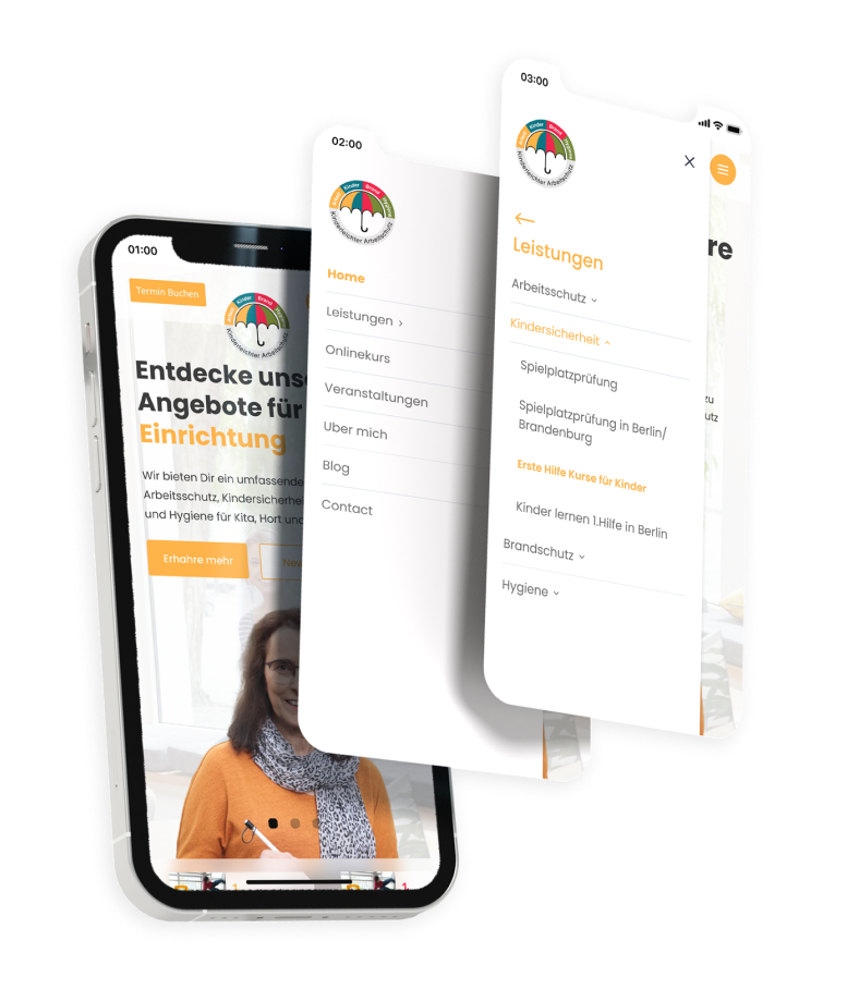 Kinderleichter ArbeitsschutzGiving a safety-services business its first digital product
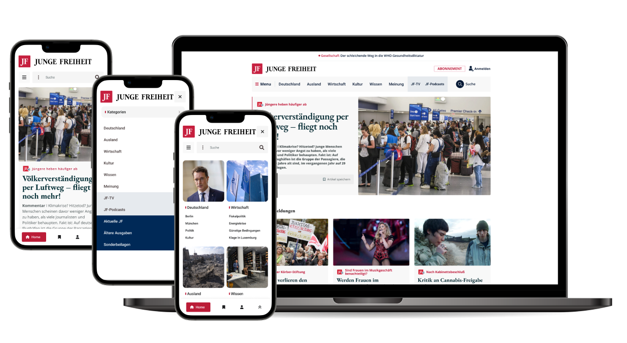 Junge FreiheitMaking a decades-old publication legible again online